SentiLink

Two ways to
look certain.

A fraud intelligence company can win on being the sharpest system in the category, or on being the one you trust with the problem. Those are different companies visually. We built both, all the way through, so the choice could be made by looking rather than arguing.

DisciplineBrand identity, art direction
SectorFintech, identity verification
ScopeTwo directions, four applications each
Year2025

The problem
with agreement

Every company in fraud prevention says the same three things. Accurate. Trusted. Built for scale. The words have stopped carrying information, which means the visual system has to do the work the copy no longer can.

The real fork is not aesthetic, it is strategic. Do you want to be believed because you are obviously more rigorous than the alternative, or because you are obviously easier to work with than the alternative? Both are defensible. They produce almost opposite design systems, and most companies discover which one they wanted only after they have paid for the other.

So we stopped presenting mood boards and started presenting consequences.

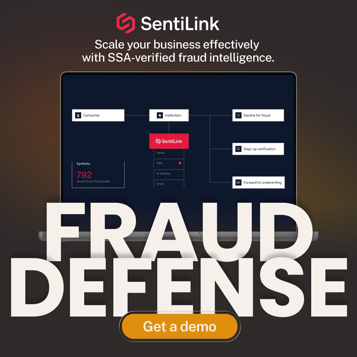
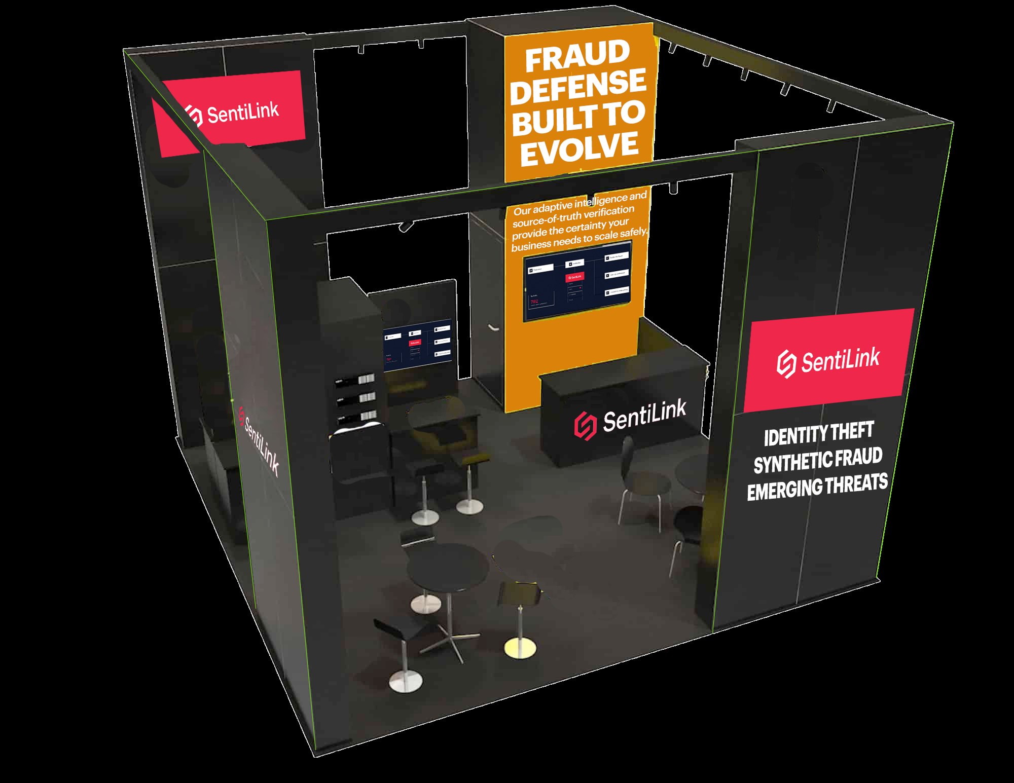
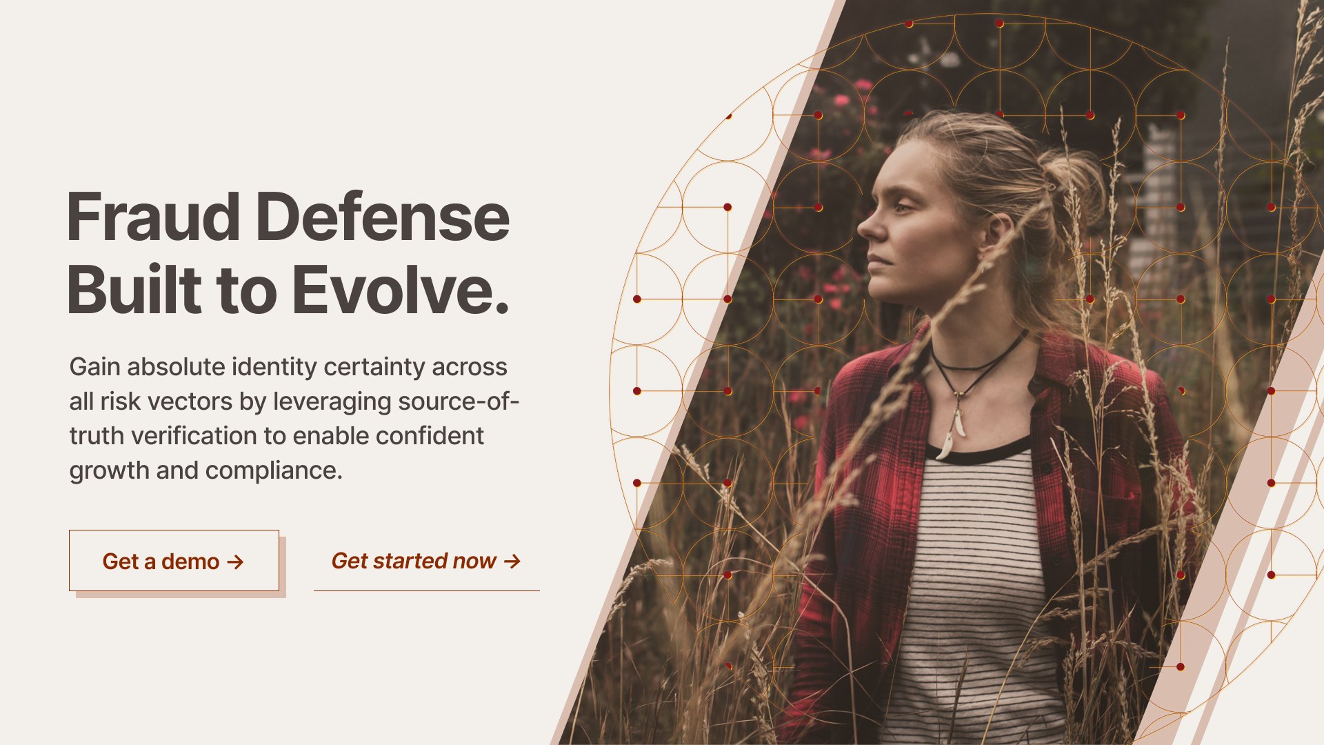
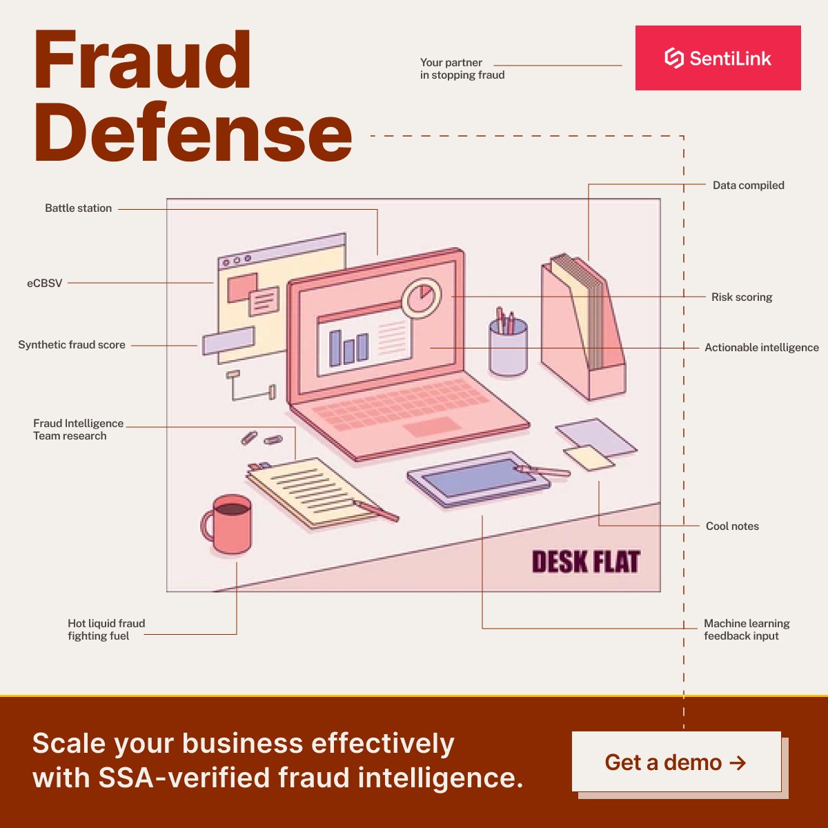
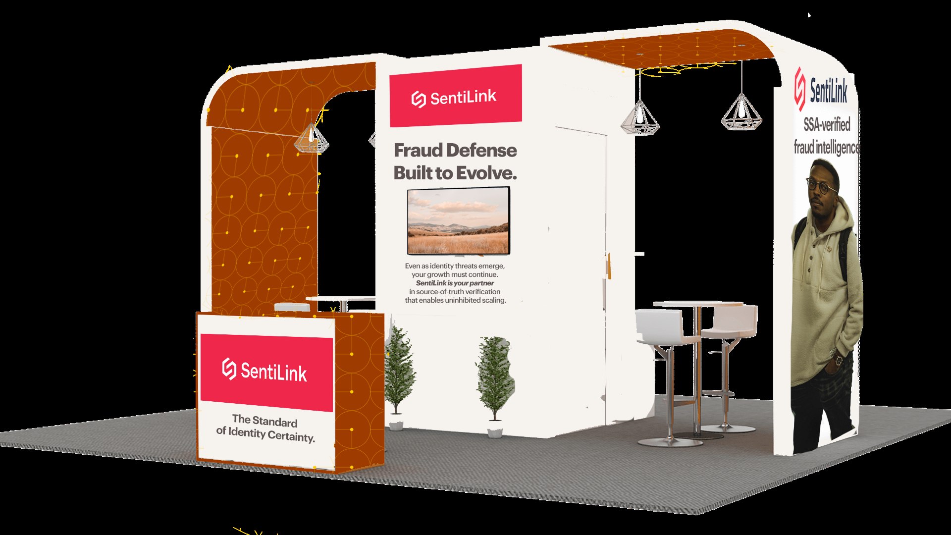
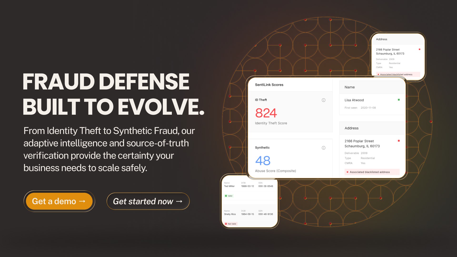
Each direction was carried from the mood board through a homepage hero, a paid social unit, and a physical trade show booth. Four surfaces, chosen because they are the four places a fintech buyer actually meets a brand, and because a direction that looks strong in a deck can fall apart the moment it has to be fabricated in plywood and lit under a convention center ceiling.

Direction 01

Precision and
Intelligence

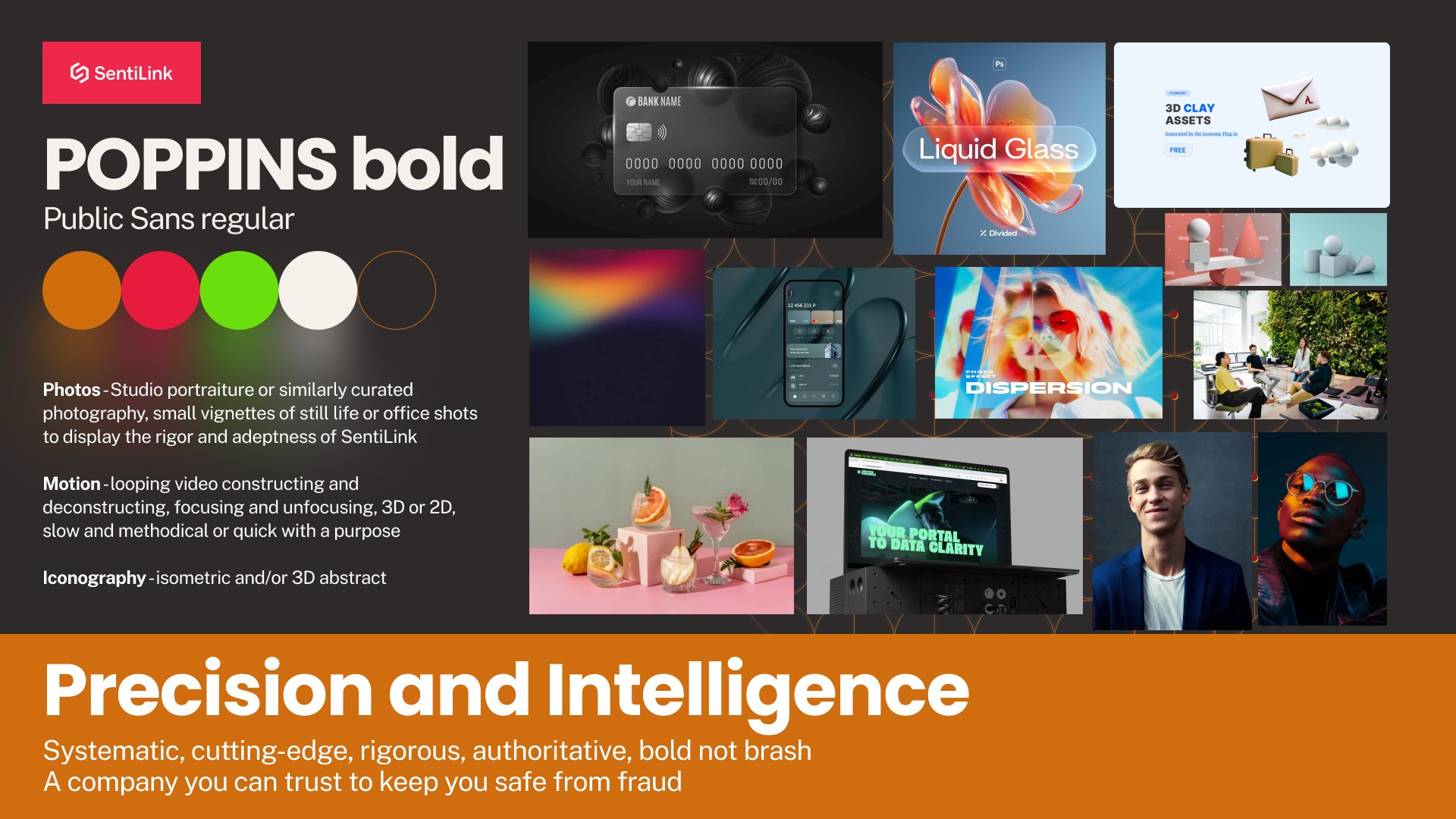
SystematicRigorousAuthoritativeBold, not brash

A company you trust because it is visibly more sophisticated than the thing it is defending you against. Dark surfaces, hard structure, and the product itself doing most of the persuading.

Poppins Bold against Public Sans, studio portraiture with controlled light, fine-line and abstract 3D iconography, and motion that constructs and deconstructs rather than glides. The system reads engineered, which is the point when the buyer's fear is that fraud is smarter than their vendor.
Direction 02

Trust and
Authority

WarmCalmApproachableFamiliar

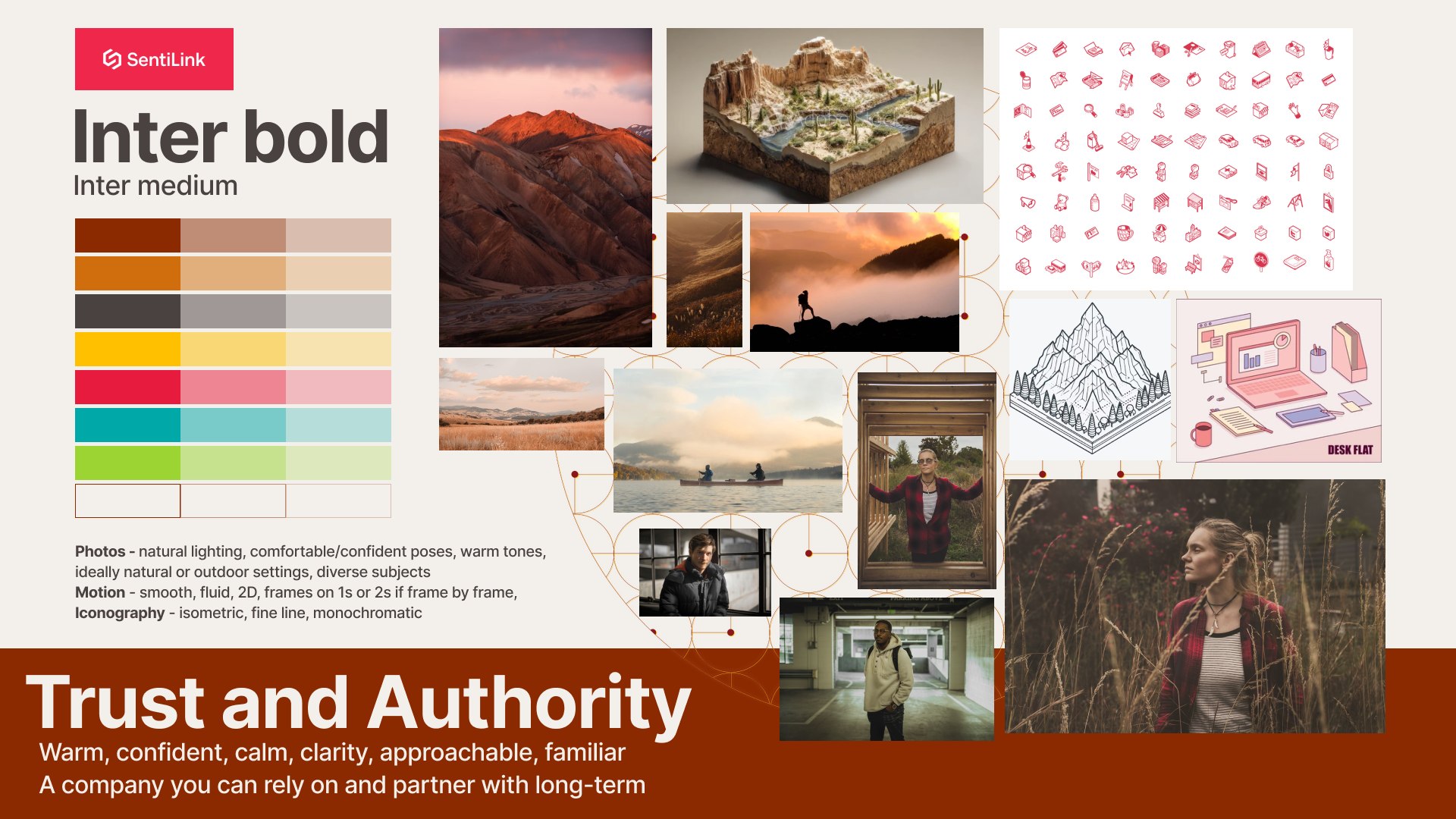
A company you rely on because it behaves like a partner rather than a product. Warm ground, natural light, and illustration that explains the machinery instead of hiding it.

Inter throughout, photography shot in real settings with comfortable subjects, isometric line illustration at a low frame rate, and a palette built from terracotta and cream rather than the category-standard navy. The system reads human, which is the point when the buyer's fear is being locked into a vendor who will not pick up the phone.

The range is the argument.

Both directions are correct. That is not a hedge, it is the finding. One company wants to be the smartest system in the room and the other wants to be the one that answers the phone, and a brand system cannot be both without becoming neither.

What this work demonstrates is not a house style. It is the ability to build two coherent, fully resolved worlds from the same brief and carry each one far enough that the difference becomes obvious to someone who does not design for a living. Choosing gets easy once you can see what you are choosing between.

Next

Sogolytics

A commodity survey tool, repositioned →