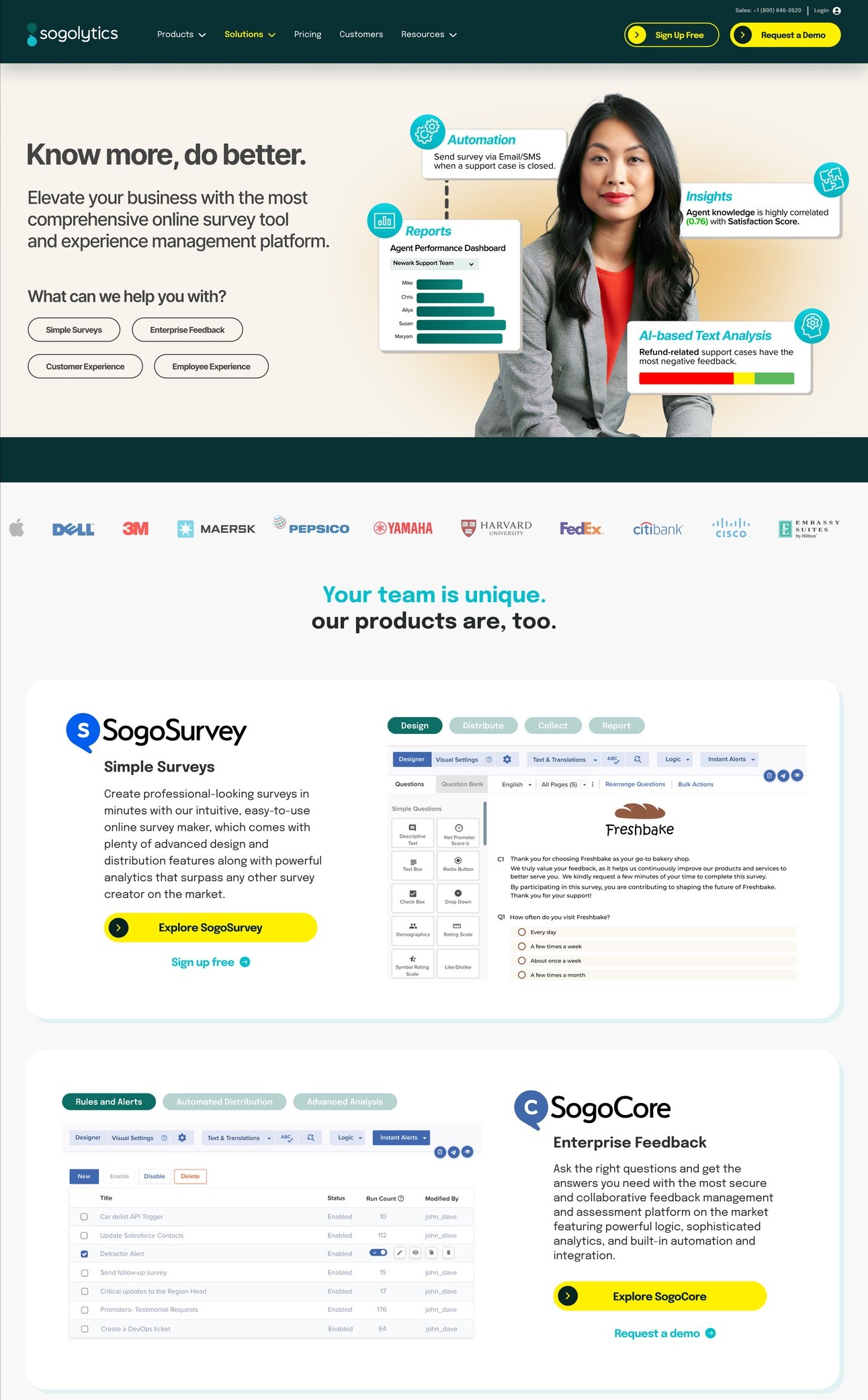
SoGoSurvey competed on being cheaper in a category that had stopped paying attention. The work repositioned it as Sogolytics, an enterprise experience management platform going directly at Qualtrics and Medallia. New name, new identity, new voice, new site, and a coordinated launch across every channel at once.
SoGoSurvey had a real product and a name that told buyers exactly where to file it. Survey tool. Budget tier. Not for us. Enterprise buyers were not rejecting the software, they were rejecting the category the name put it in, which meant no amount of feature marketing was going to move the deal size.
The rebrand was not a coat of paint. It was an argument that the company had outgrown the word "survey" and needed to be understood as an experience management platform. That argument had to survive a name change, a sub-brand architecture, a full visual system, a new site, and a sales team who had to walk into renewals and explain it.
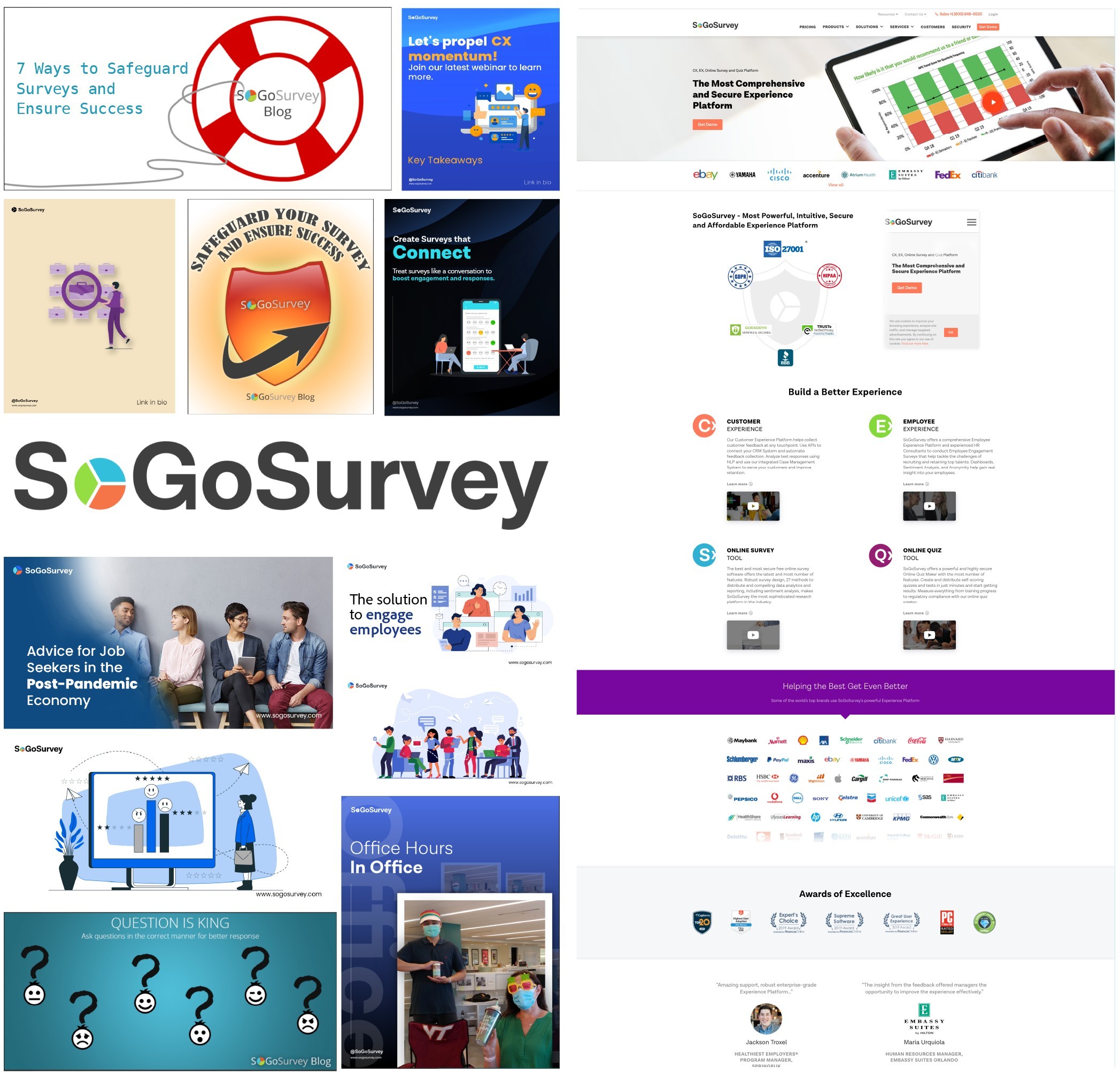
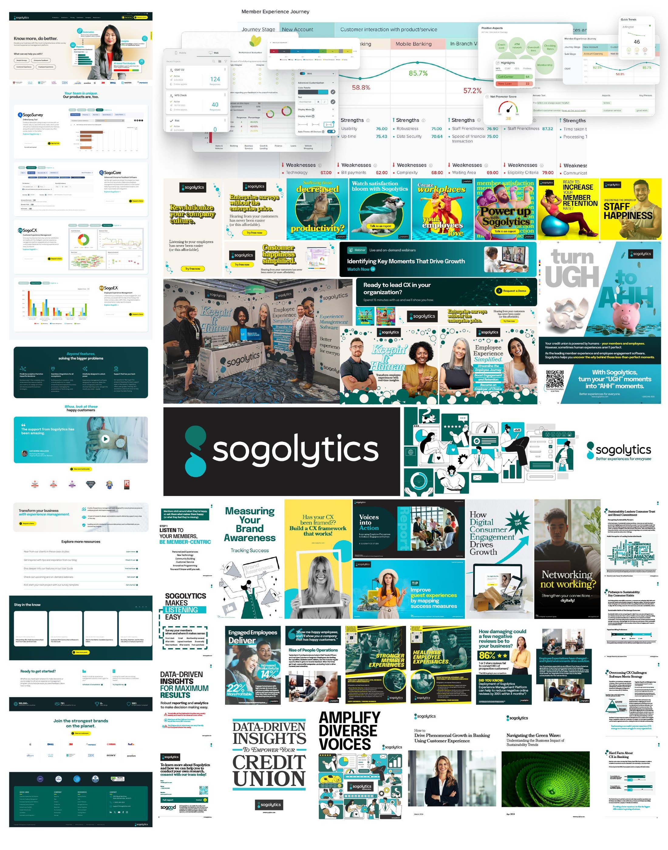
The clearest way to explain what a rebrand buys is to put the two systems next to each other and stop talking.
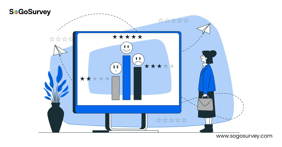
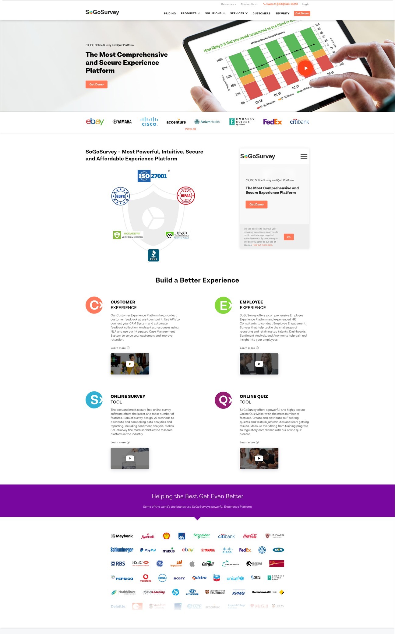
On the left, a company that looked like every other survey tool: stock illustration, a palette borrowed from the category, and templates that changed shape every month. On the right, a system with a point of view, a proprietary illustration style, and enough structure that a marketing team could produce a year of work without it drifting.


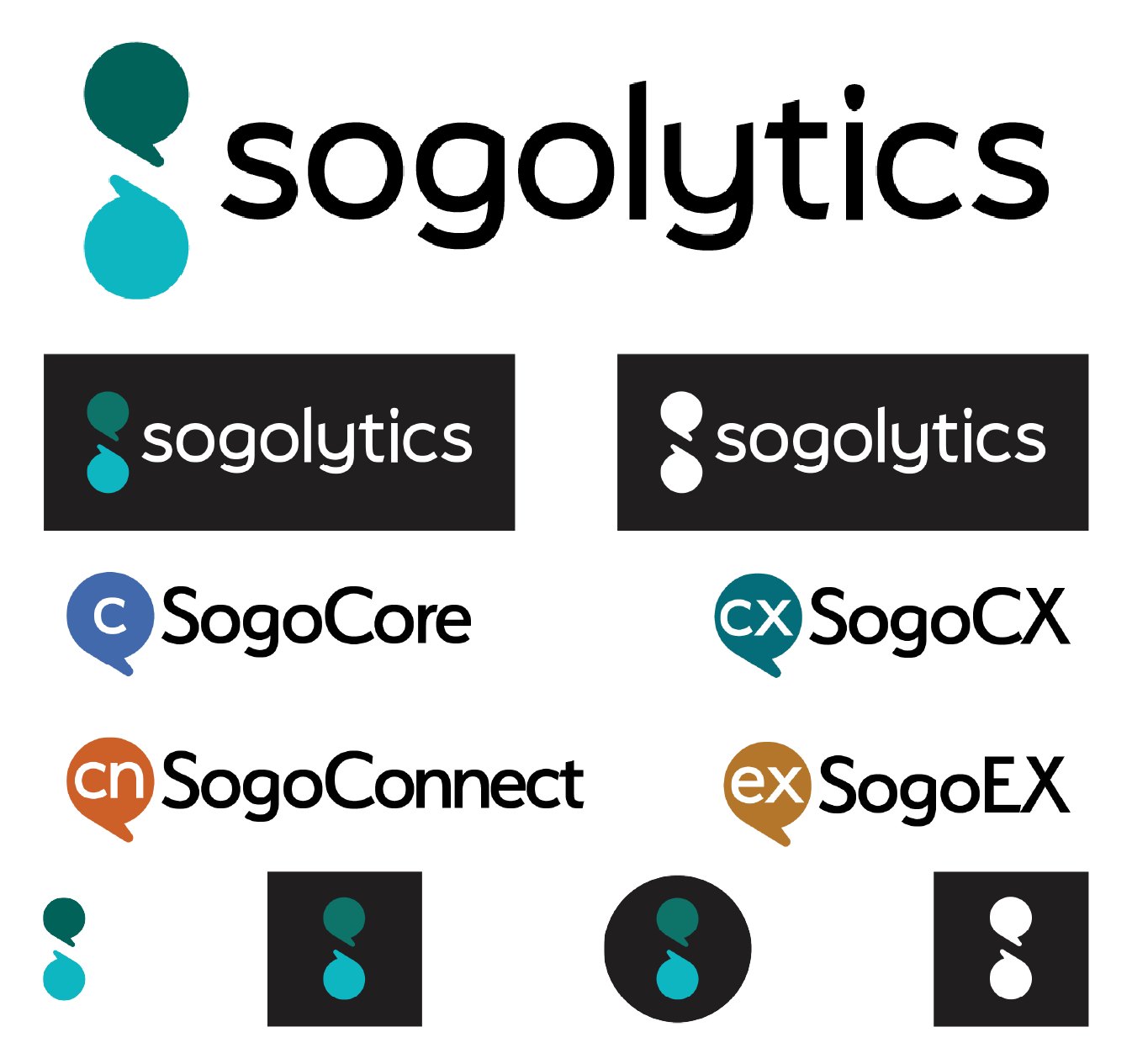
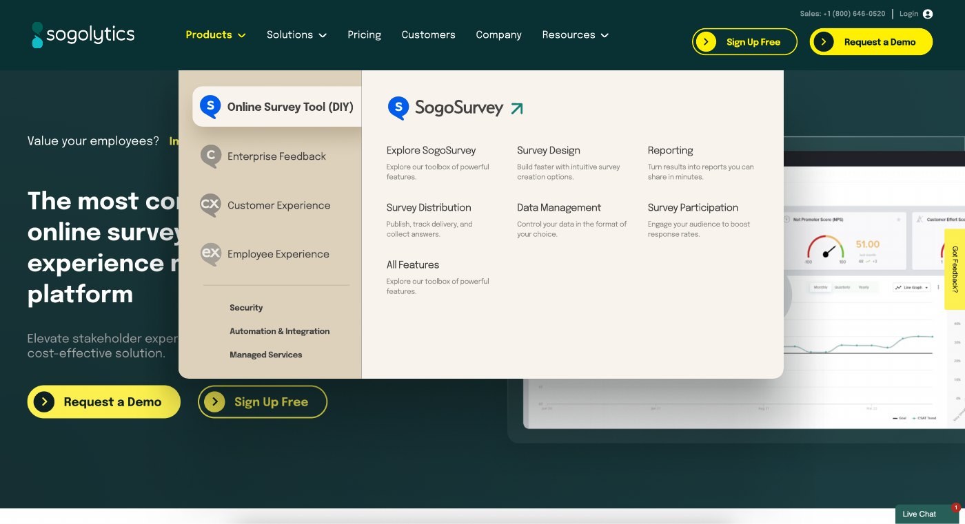
The mark had to carry a platform rather than a product, which meant a family underneath it. SogoCore, SogoCX, SogoConnect, and SogoEX each got a lockup that reads as its own thing while staying unmistakably part of the same company.
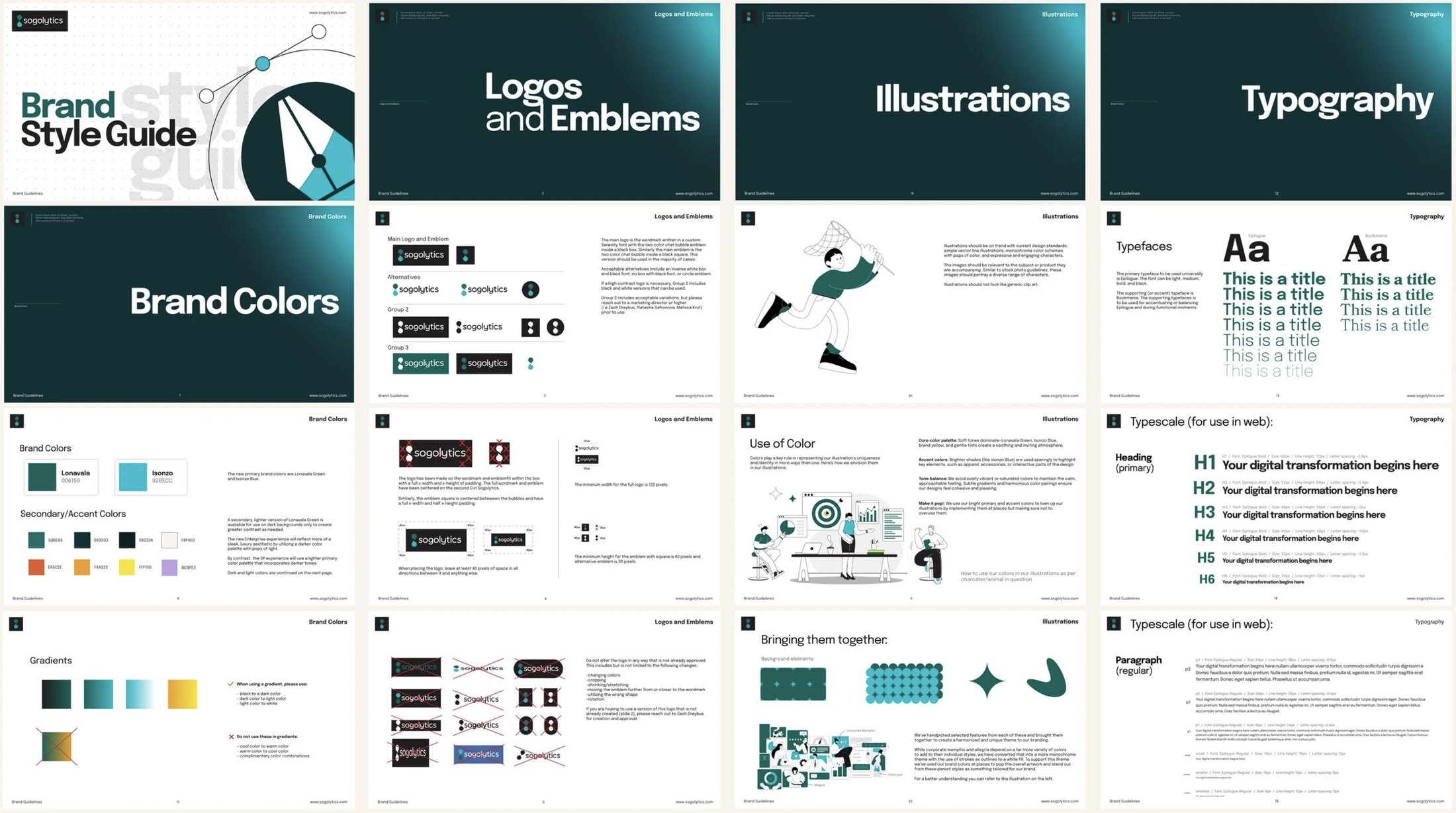
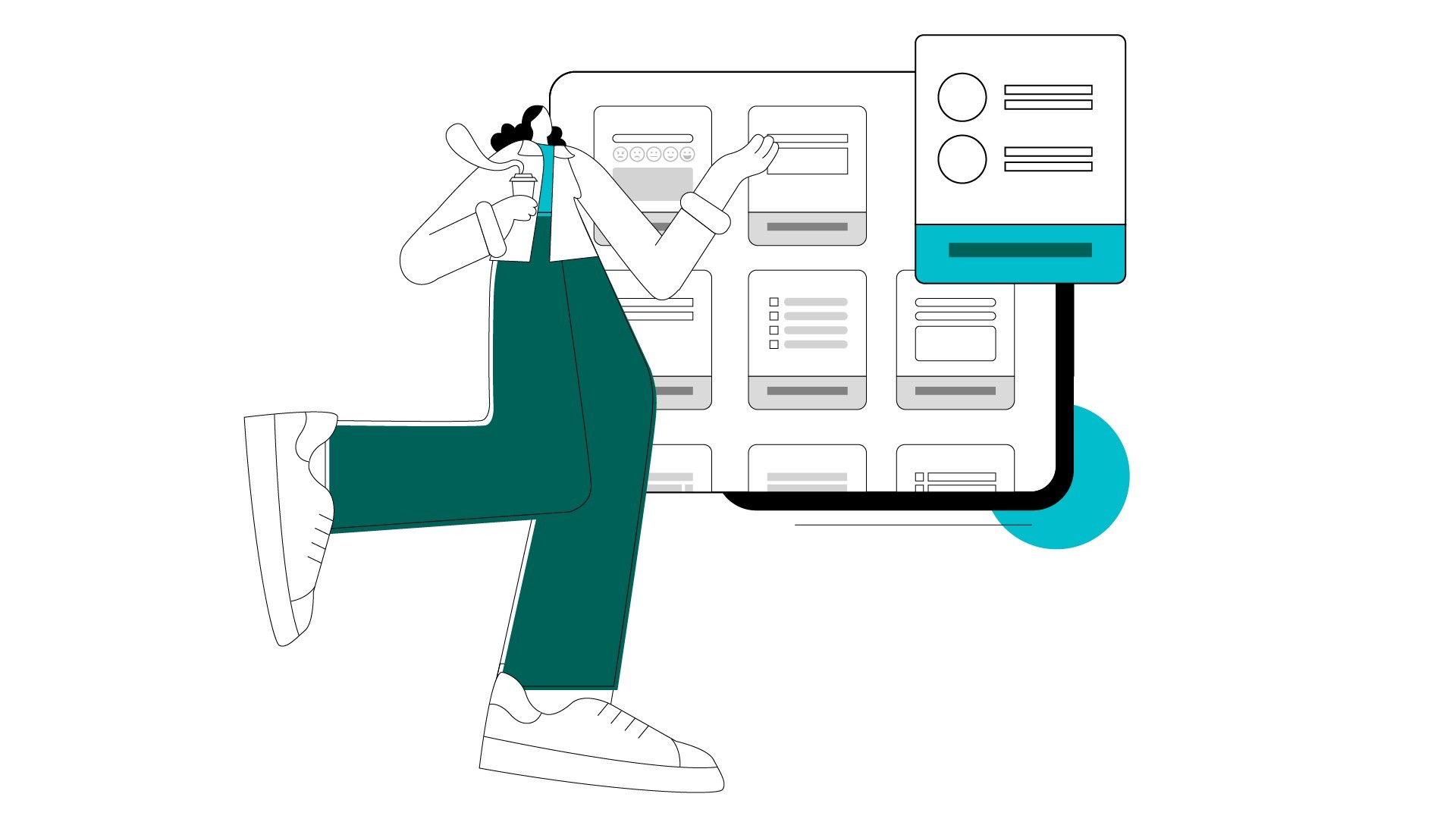
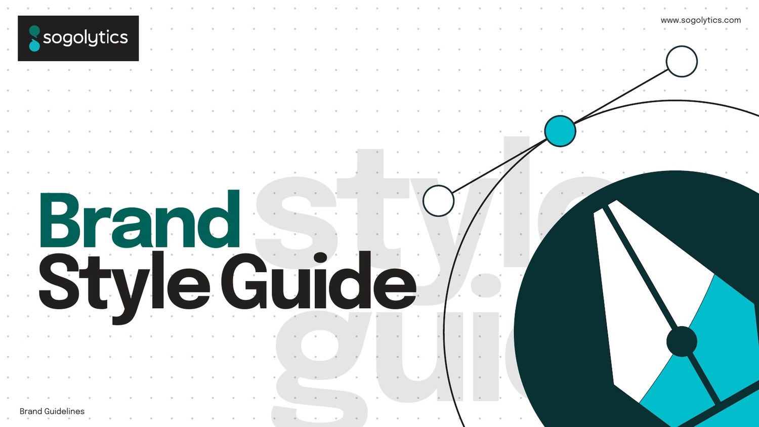
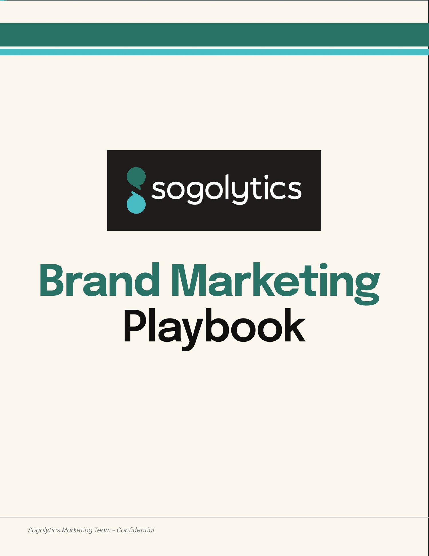
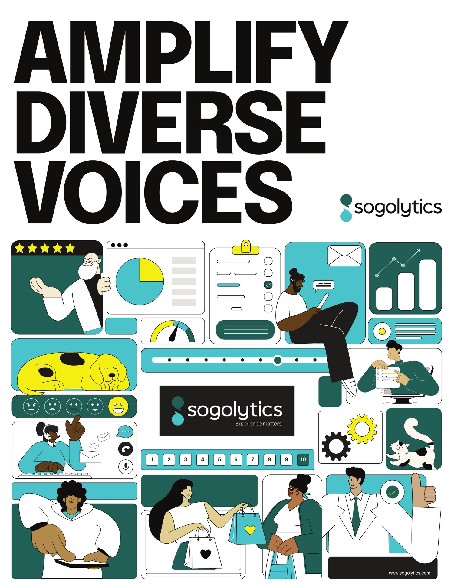
Documented twice over. A Brand Style Guide for anyone making something, and a Brand Marketing Playbook for anyone deciding what to make. Plus a proprietary illustration system, because stock was the single loudest signal that the old brand was a budget brand.
Then the part that actually decides whether a rebrand survives contact with a company: we wrote the go-to-market channel strategy, trained the department on it, and enforced it. Guidelines nobody is taught are decoration. This engagement ran the training sessions, held the line in review, and kept the system intact across every team that touched it.
Preview 3 pages
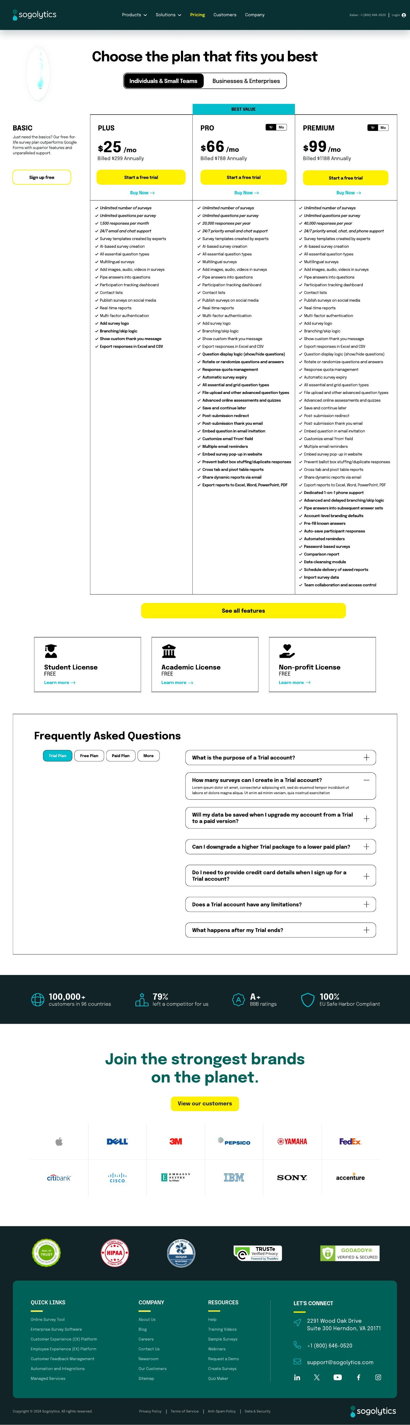
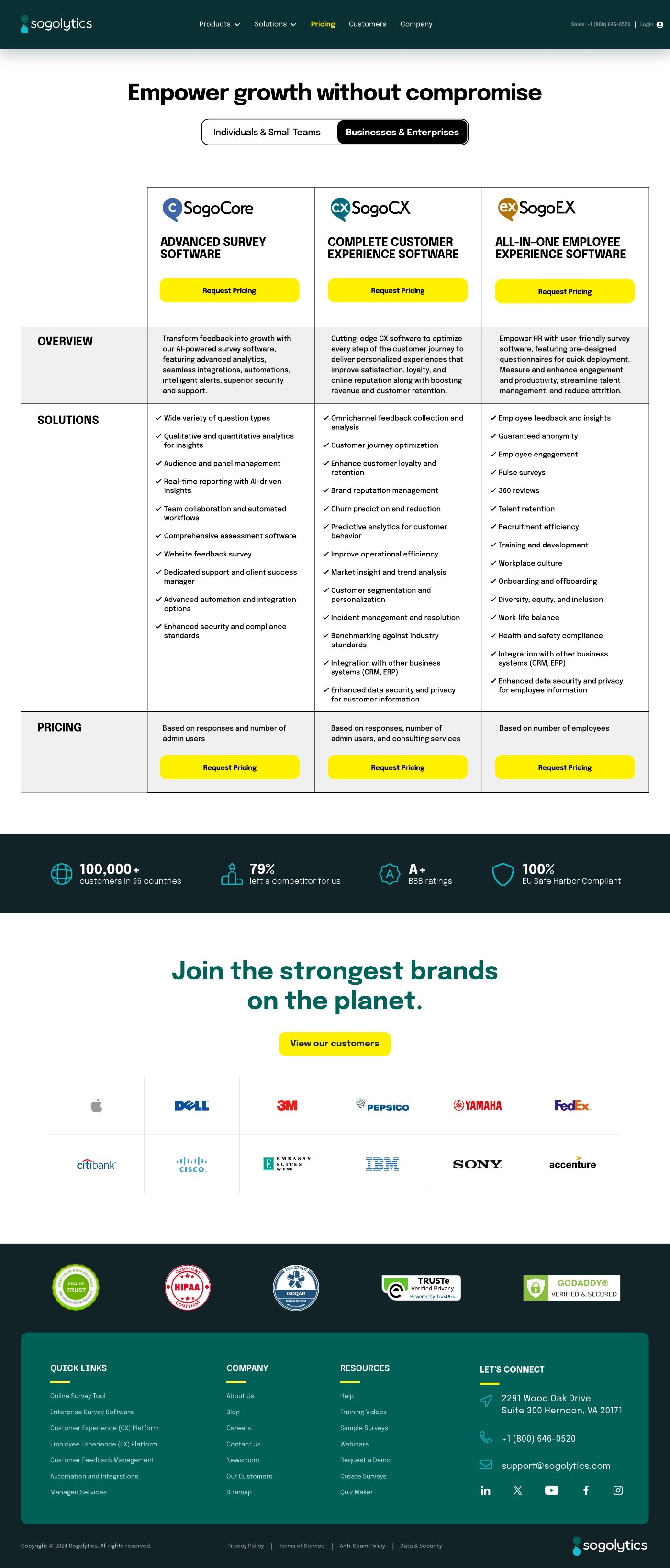
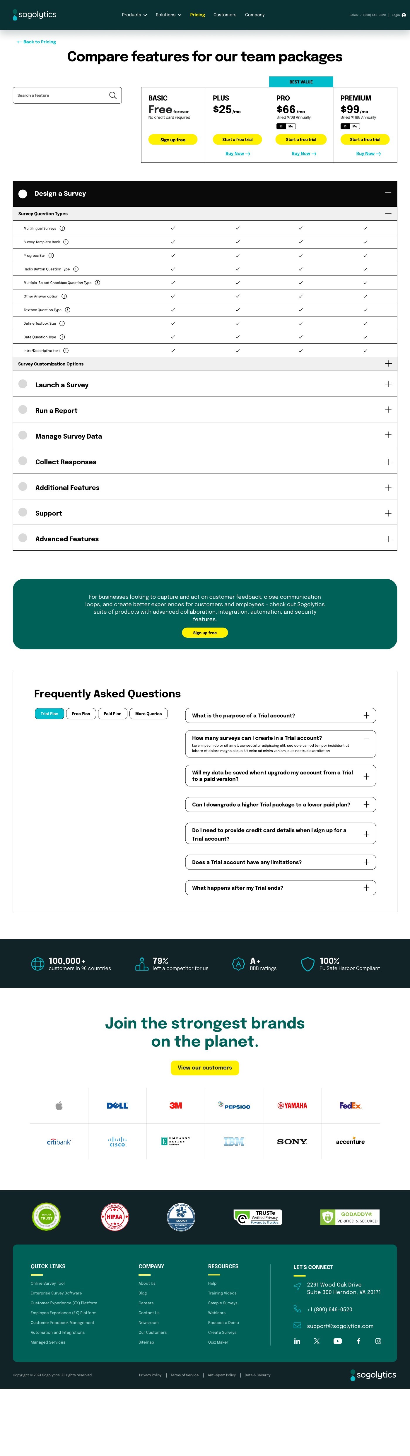
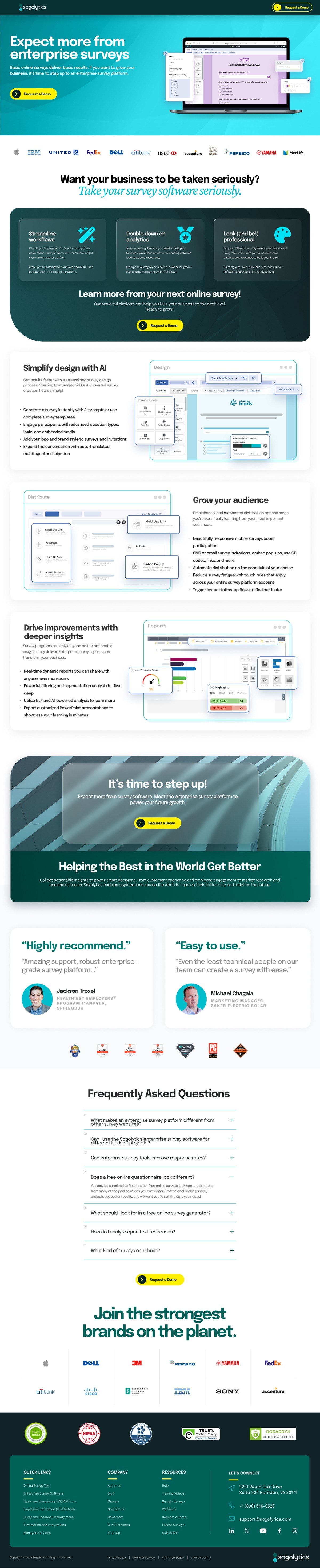
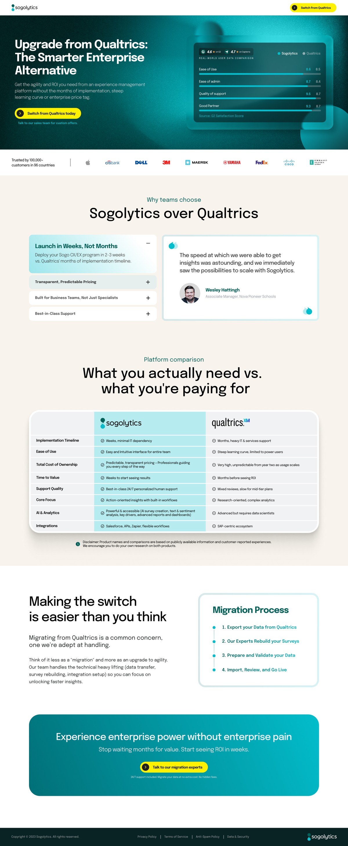
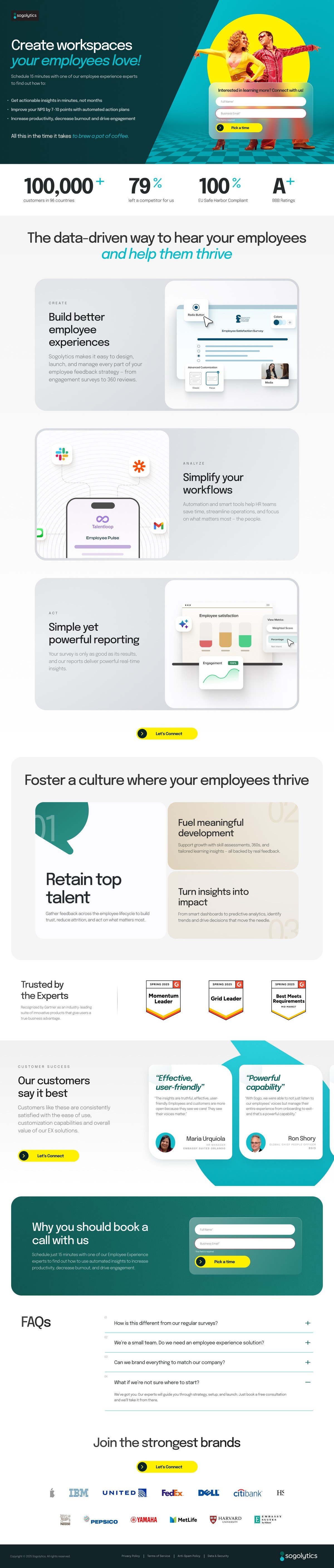
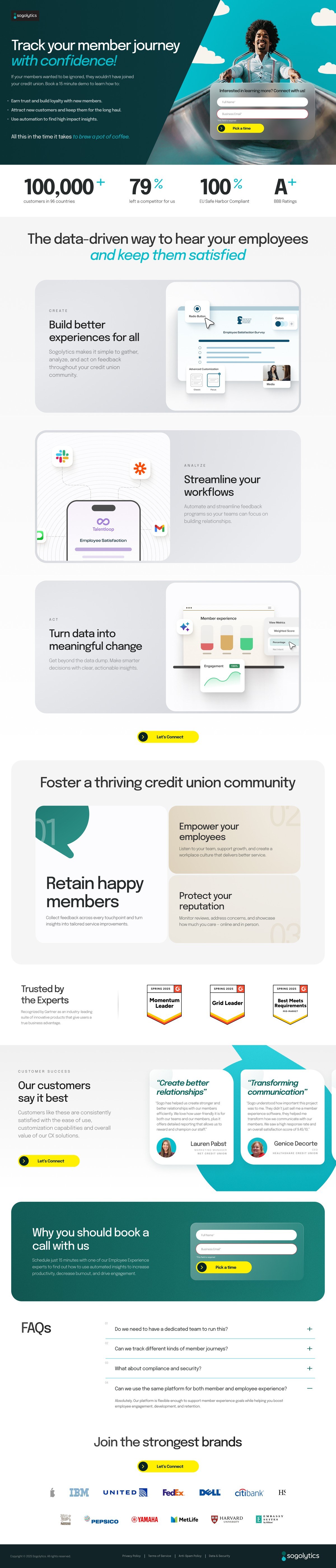
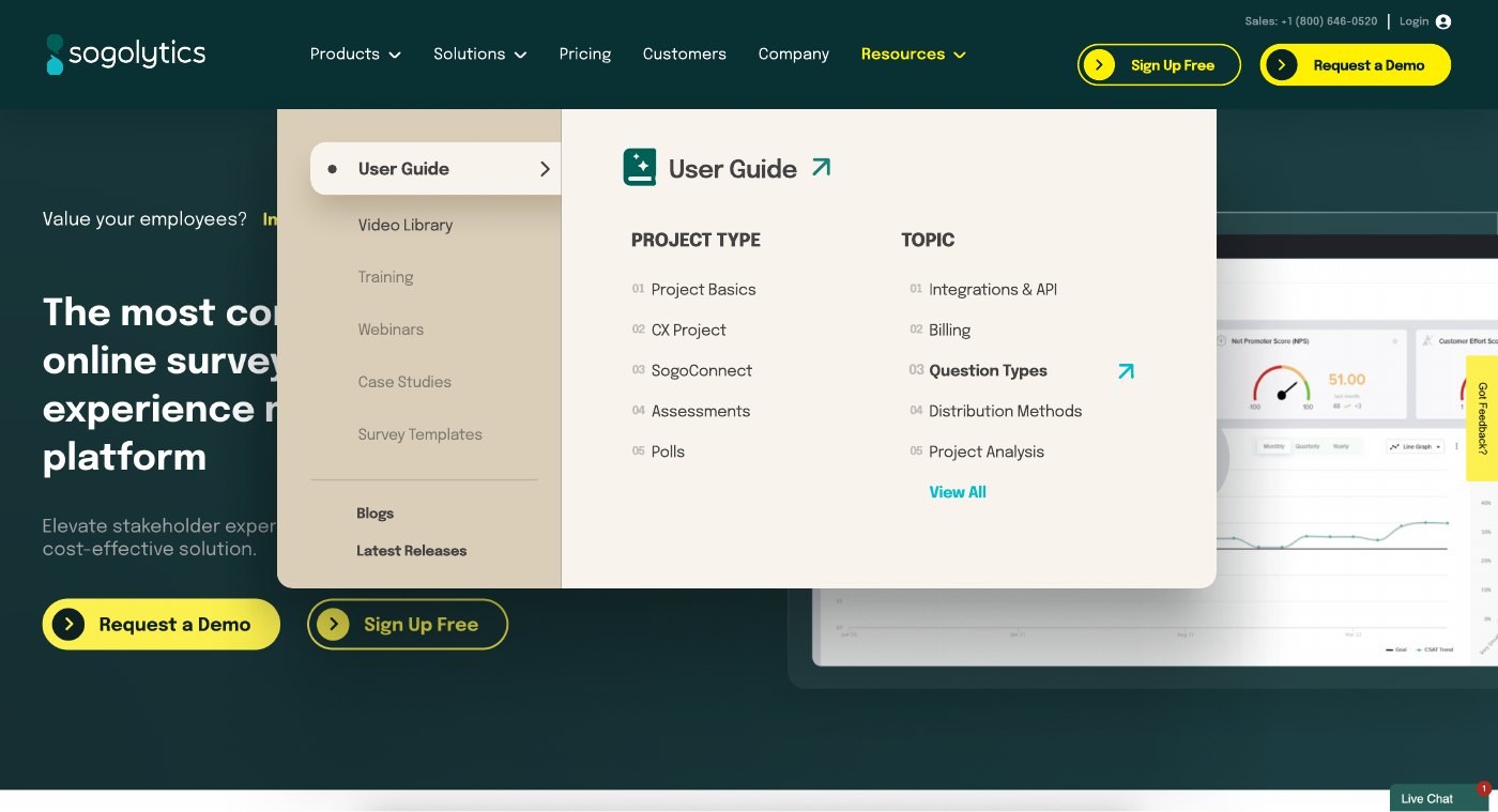
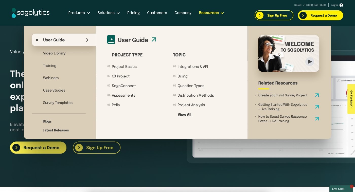
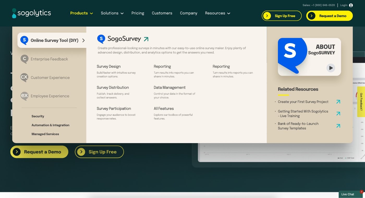
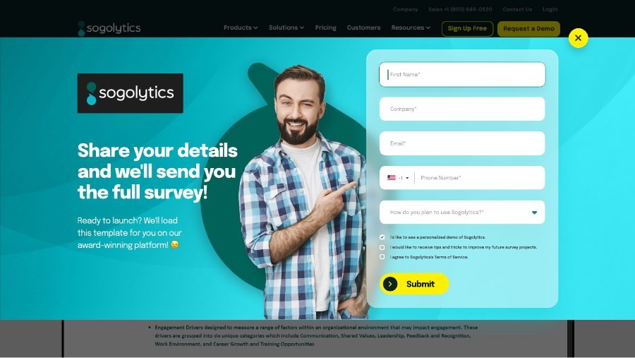
Preview 3 pagesThe site was rebuilt page by page off a shared component library rather than as a set of one-off designs. The homepage carried the new positioning, the pricing page had to make four tiers legible without a sales call, and the battlecard page had to sell against Qualtrics by name without reading as defensive.
Landing pages were then cut per vertical and per competitor from the same kit, which is how a two-person team kept up with a demand-gen calendar.
Homepage
Pricing · individuals and small teams
Pricing · businesses and enterprises
Pricing · feature comparison
Enterprise survey software
Competitive battlecard
Employee experience
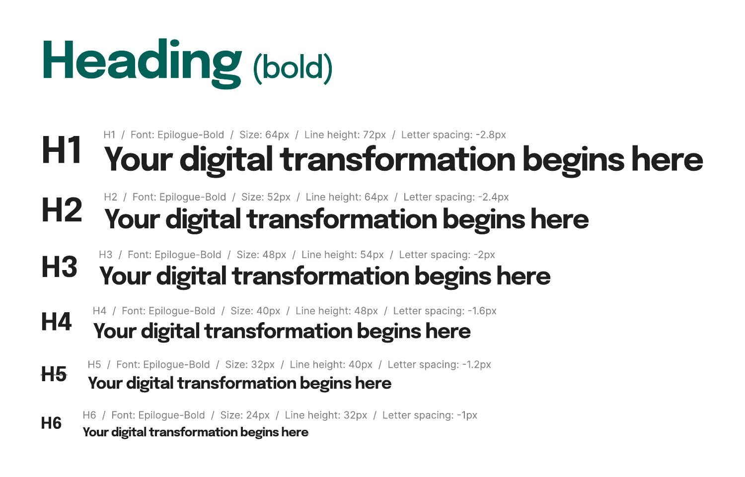
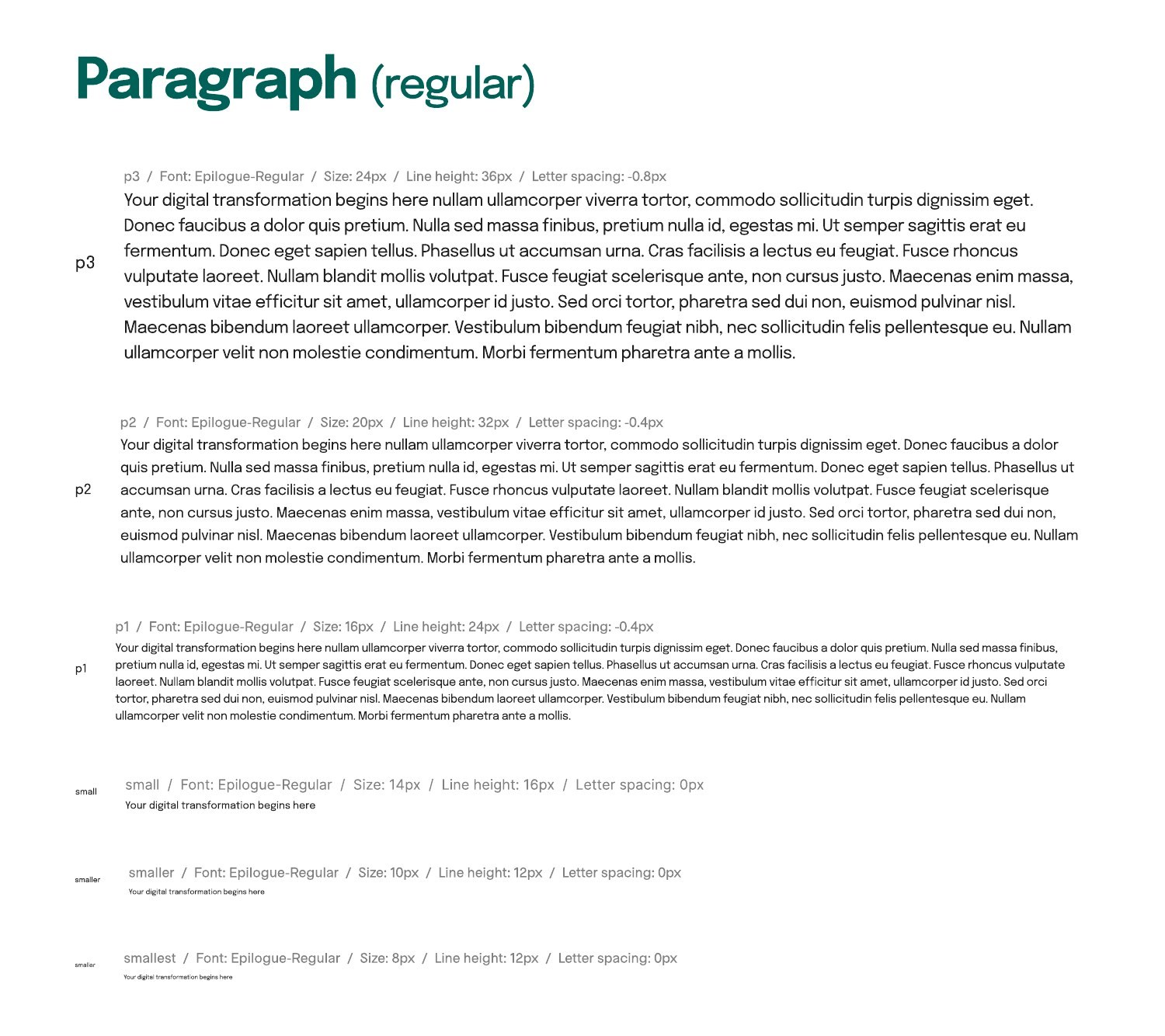
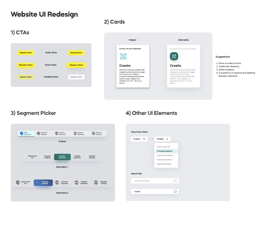
Credit union verticalThe site is not a set of pages, it is a kit. Seventy-five documented blocks, every one of them specified down to the type step and the interaction state, so the in-house team could assemble a new page without a designer in the loop and without the brand drifting a millimeter.
This is the part that decides whether a rebrand survives. A beautiful homepage that nobody can extend is a homepage that gets replaced in eighteen months. A documented system is one the company keeps building on after the engagement ends.
Type scale · headings, REM based
Type scale · body and captions
Button states
Media control states
Navigation item states
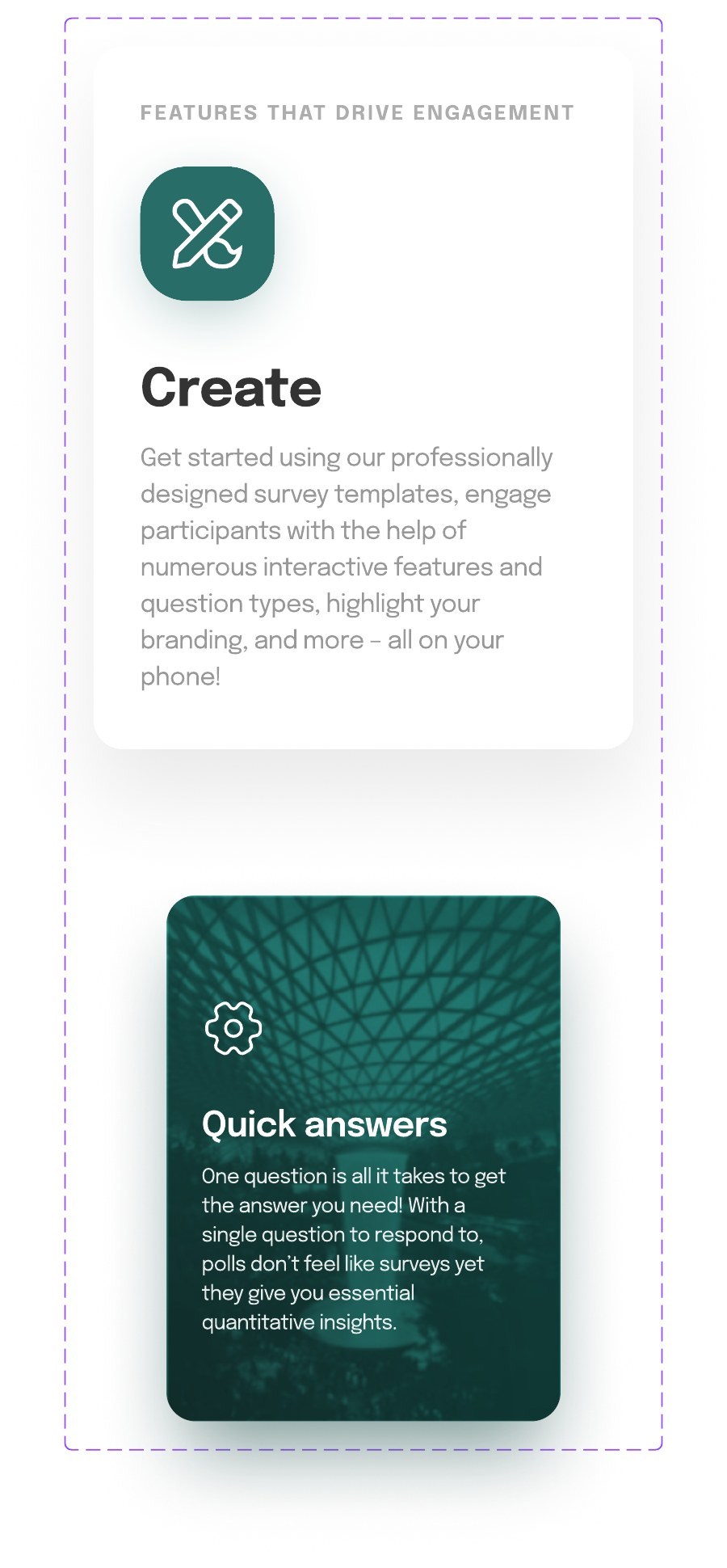
Feature cards
Content card
Content card, variant
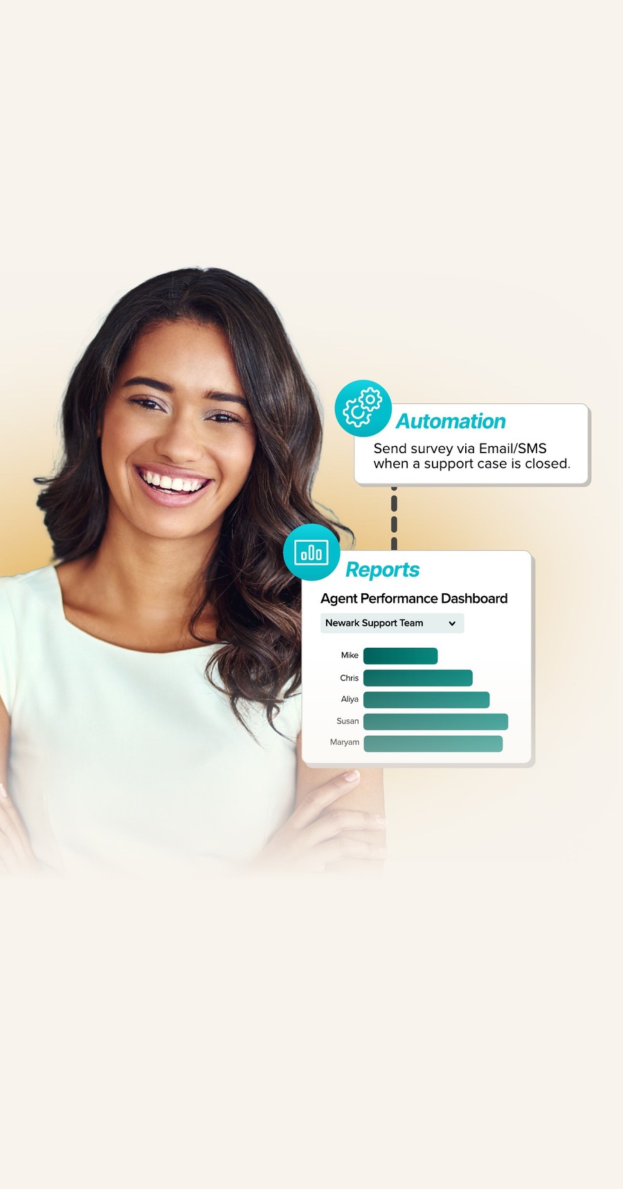
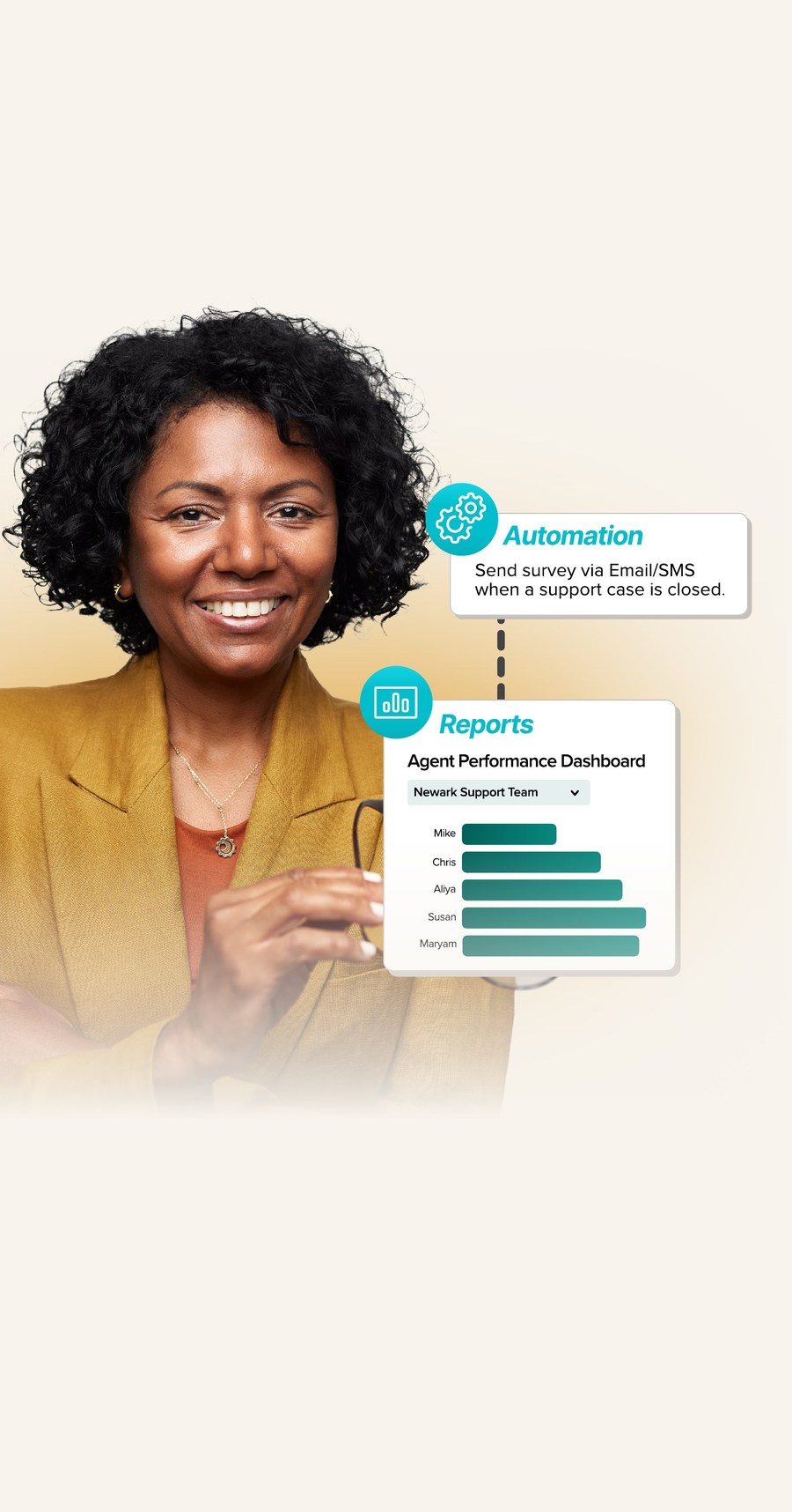
UI redesign mapSogolytics sells in a lot of places, and a homepage that opens with a face is making a claim about who the product is for. So the hero shipped in five castings and the site served the one that matched the region a visitor was in.
The product panel, the type, the spacing, and the call to action are identical in all five. Only the person changes. Localization that costs one image swap rather than one page rebuild is the whole argument for a component library.
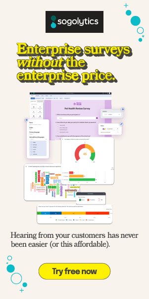
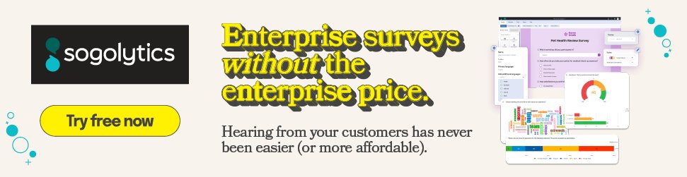
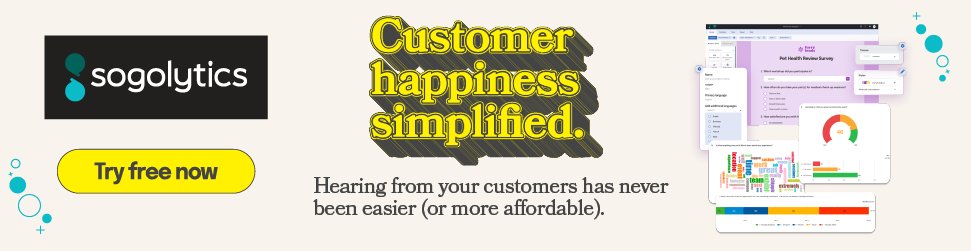
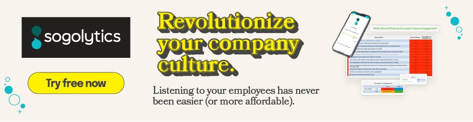
Every campaign shipped in twenty-one display sizes plus responsive units, across three product lines, at three resolutions. That is roughly two hundred files per campaign, and the only way to survive it is a system rather than a series of decisions.
What holds it together is a fixed hierarchy that degrades in a known order, so the 320 × 50 is recognizably the same advertisement as the 1200 × 1200 rather than a different one that happens to share a color.


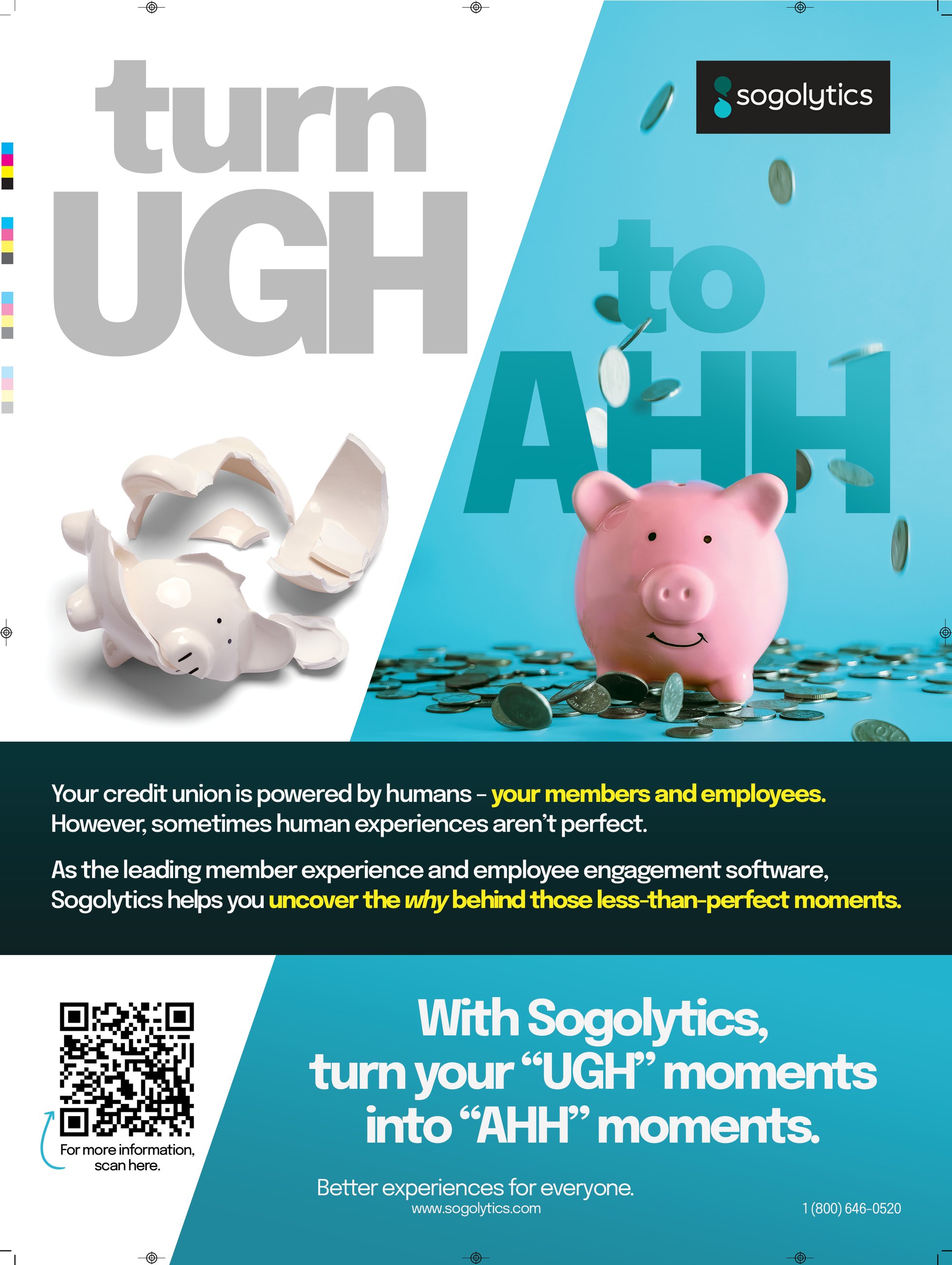
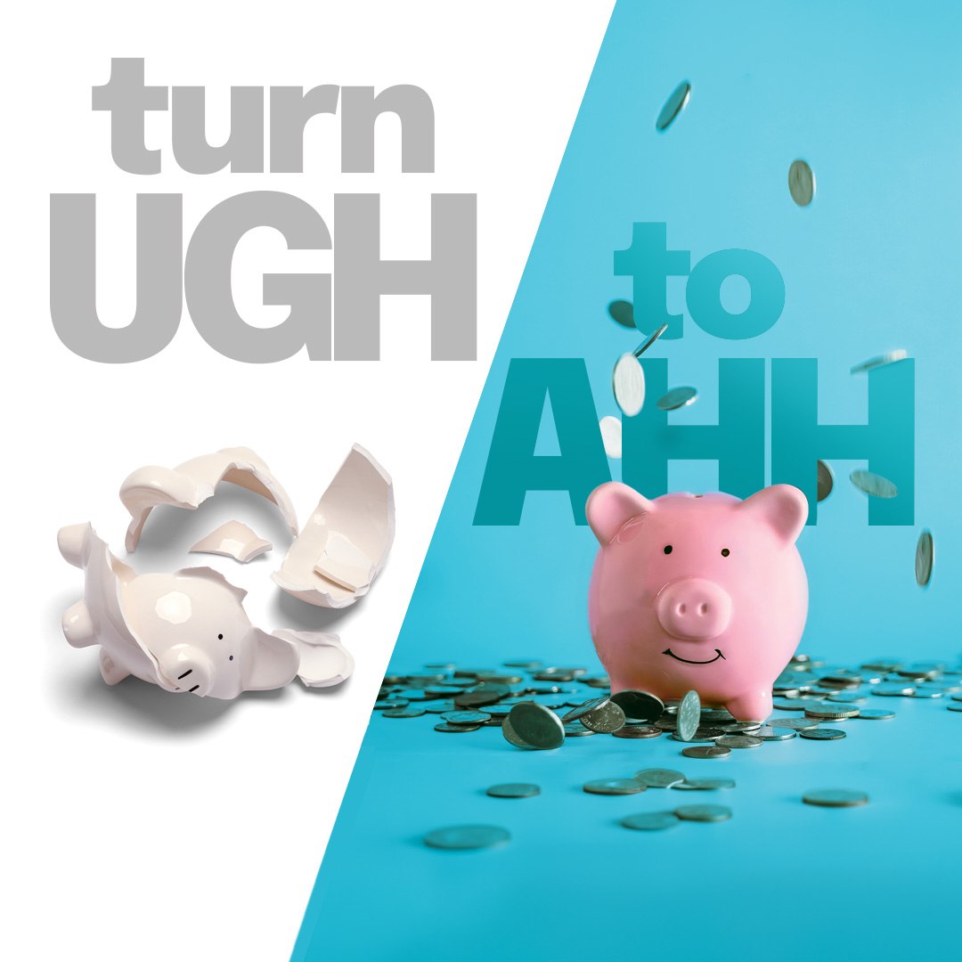
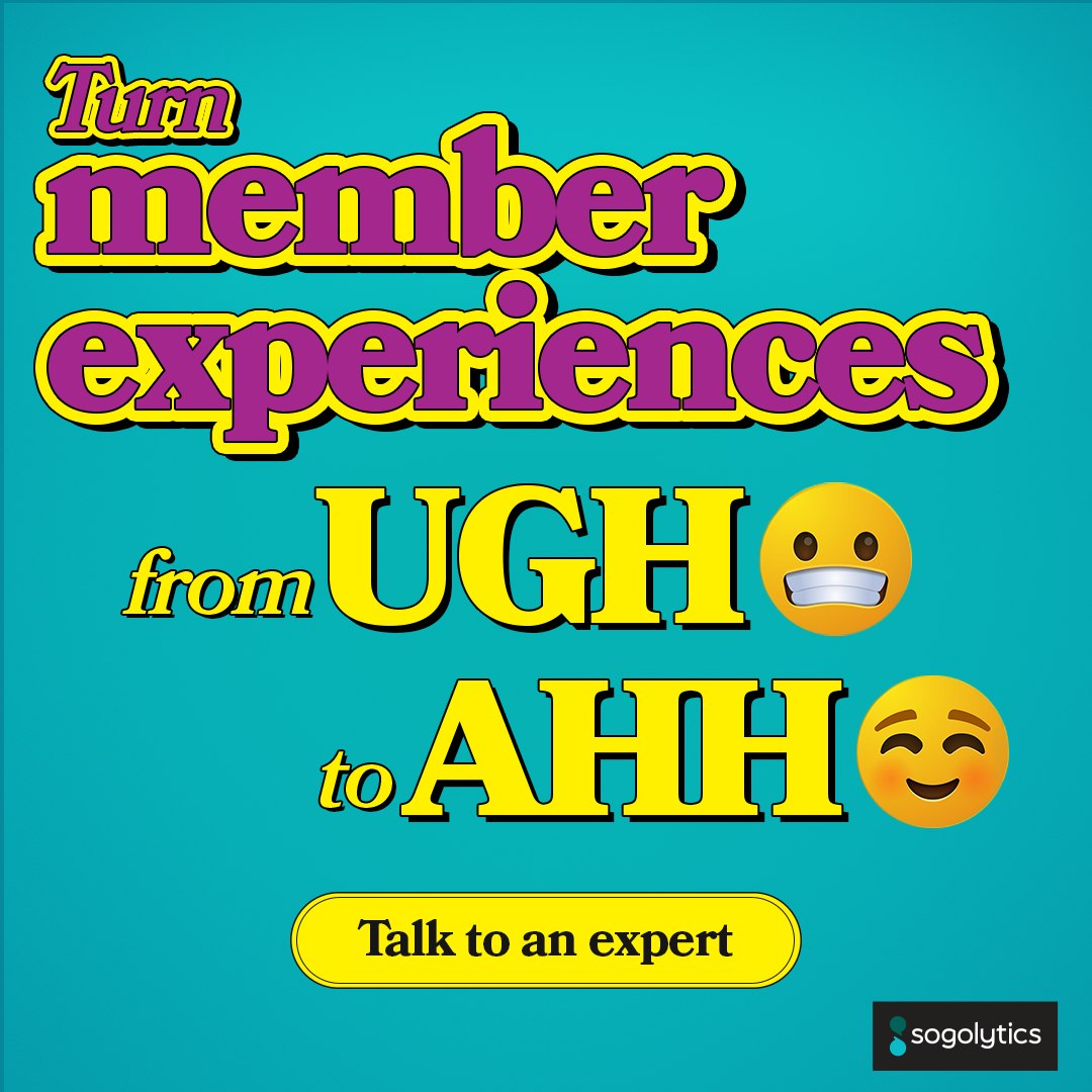
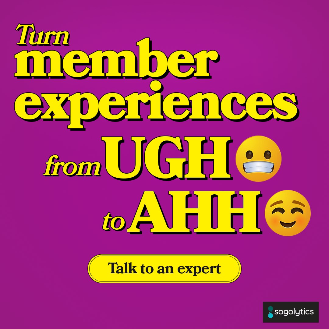
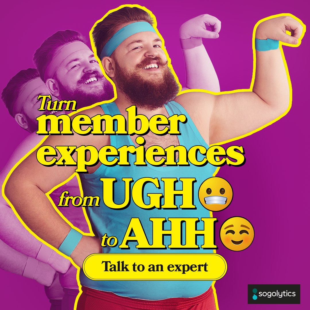
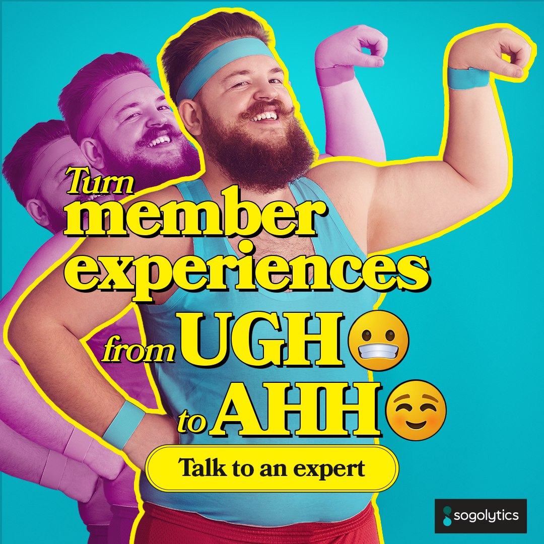
Two syllables that do the whole job. Ugh is what a member feels when the experience breaks. Ahh is what they feel when it does not. Everything else in the campaign, the color, the emoji, the call to action, hangs off that one-word swing.
It launched as a full-page print piece for credit unions and became the campaign grammar for the year, rebuilt for every vertical and every product line without ever restating the idea. Same eight words, six palettes, four audiences.
The always-on layer underneath the campaigns. Six concept families running at once, each cut for customer experience and employee experience, each cut again by vertical, and several cut a third time for a single named account.
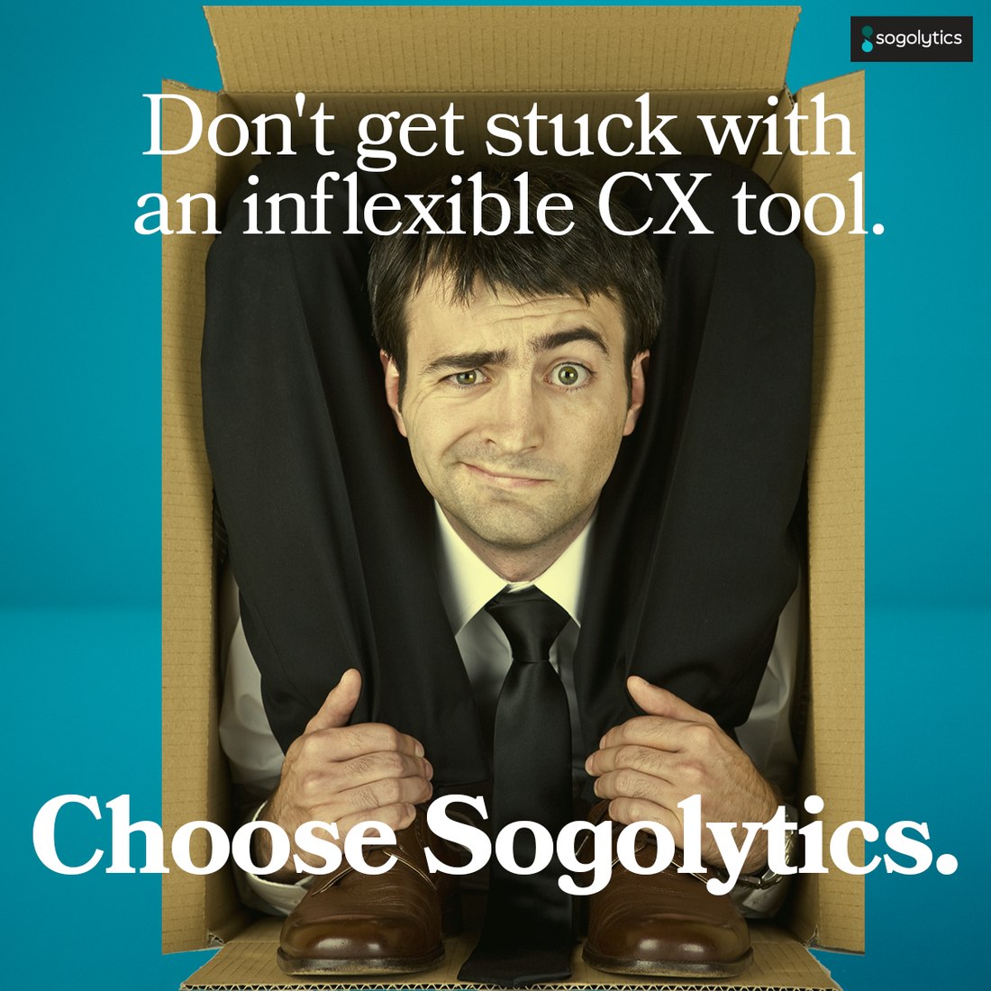
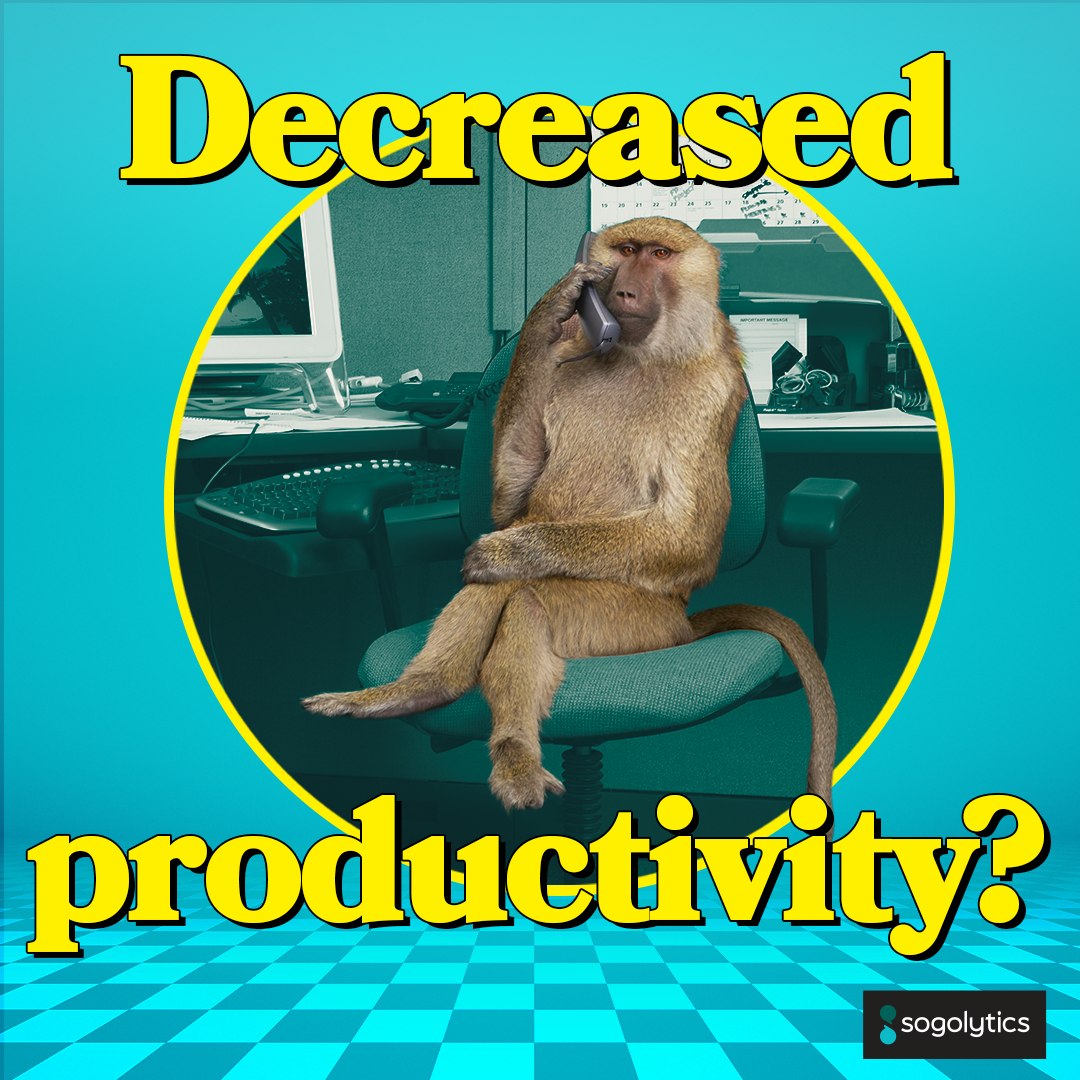
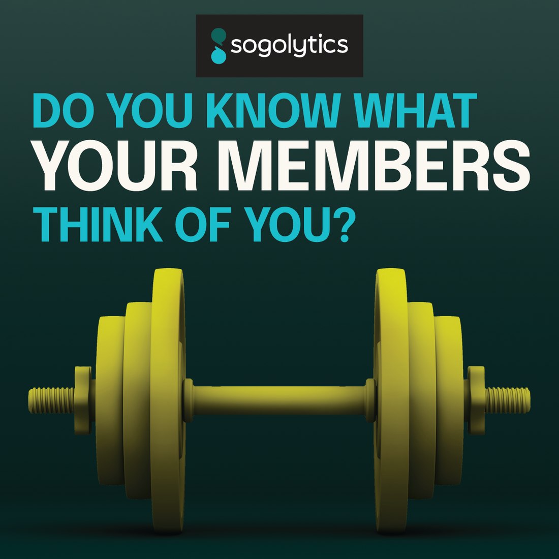
The mascot dog, the burnout baboon, the disco pair, the bodybuilder, the dumbbell, and the man trapped in an inflexible tool. Different jokes, one system: same type stack, same highlighter, same button, so a prospect who sees four of these in a week sees one company four times instead of four companies once.
Mascot · memorable moments
Mascot · satisfaction blooms
Inflexible tool · CX
Feedback analytics · CX
Burnout · employee experience
Wellbeing · EX strategy
Wellbeing · workplaces they love
Performance management · level up
Performance management · engagement
Elevate · transform the connection
Elevate · actionable insights
Elevate · satisfaction and revenue
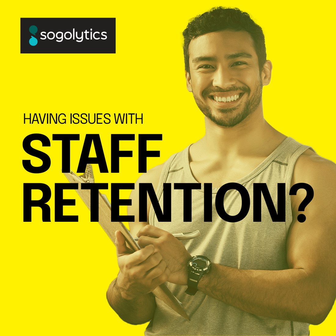
Fitness · staff retention
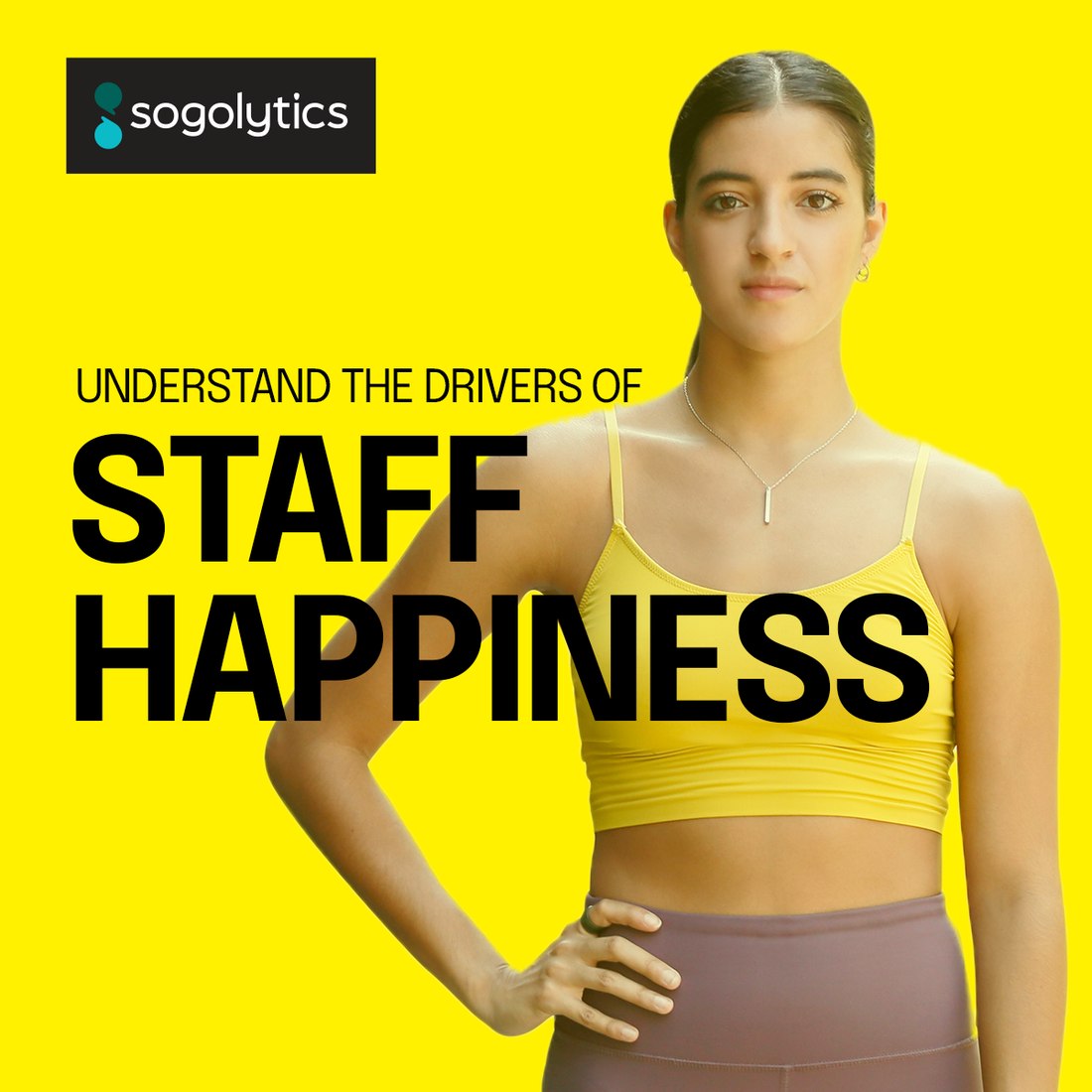
Fitness · staff happiness
Fitness · member retention
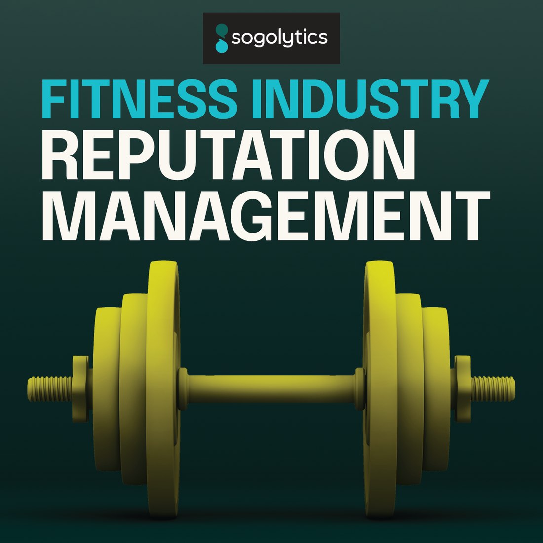
Fitness · reputation management
Fitness · what members think
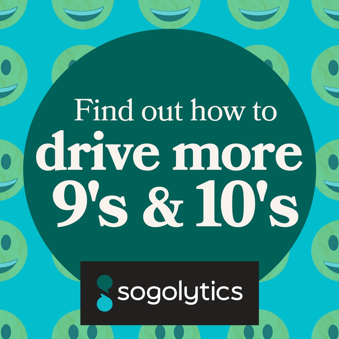
Finance · nines and tens
Finance · deep analytics
Named account · retention worry
Named account · retain more
Named account · power up
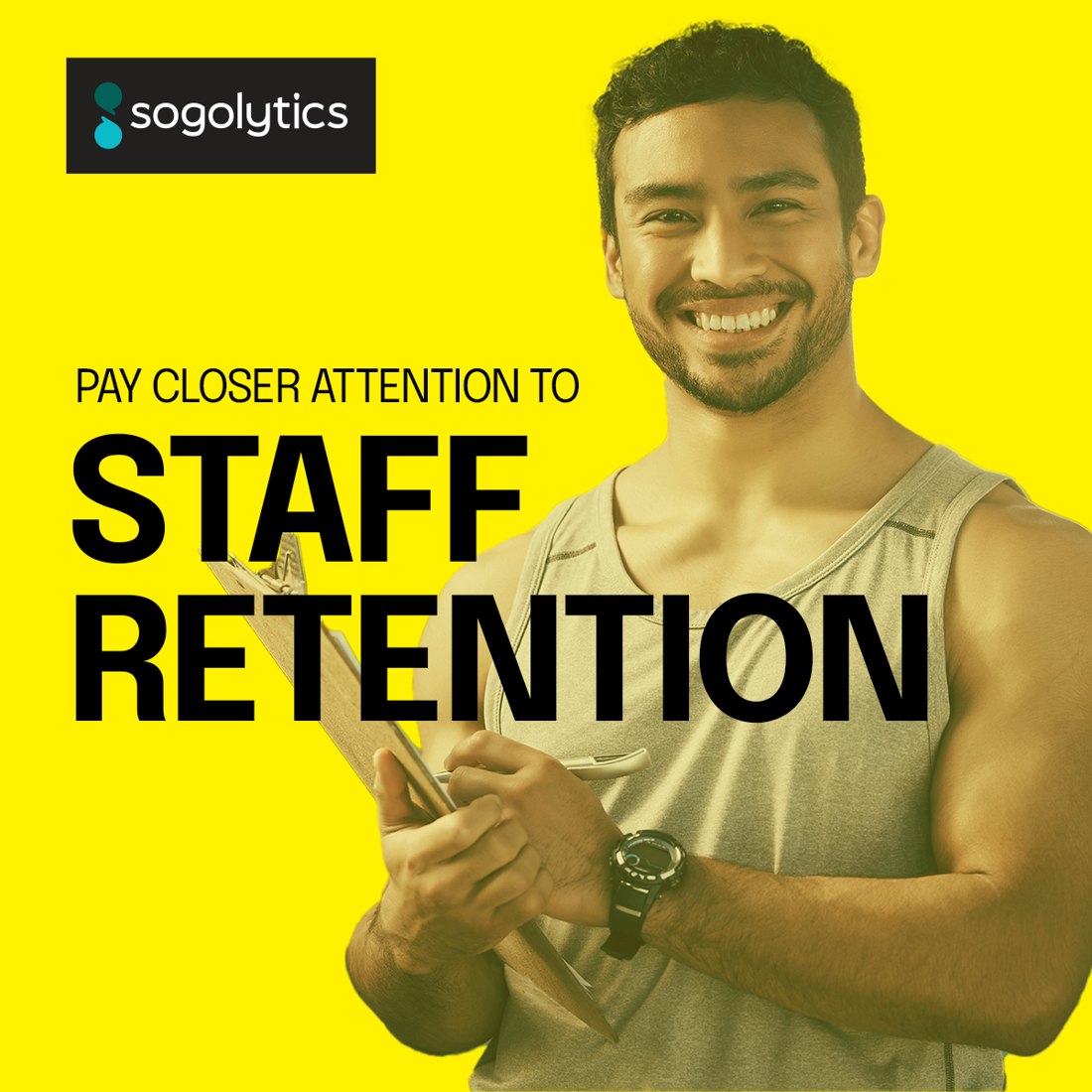
Fitness · pay closer attention
Fitness · increase retention rate
Native unit · request a demo
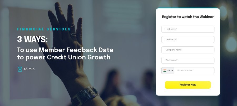
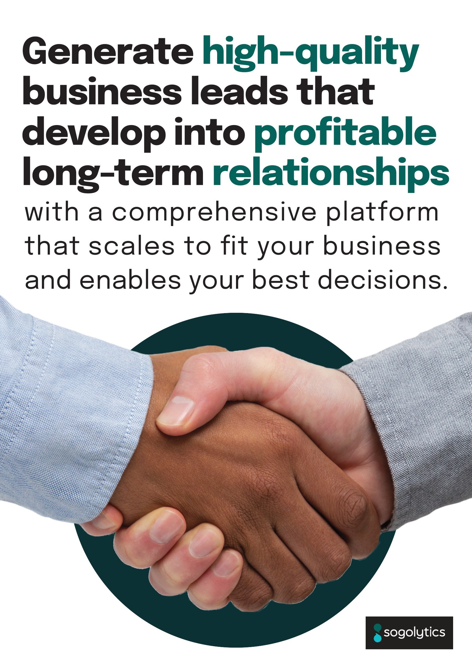
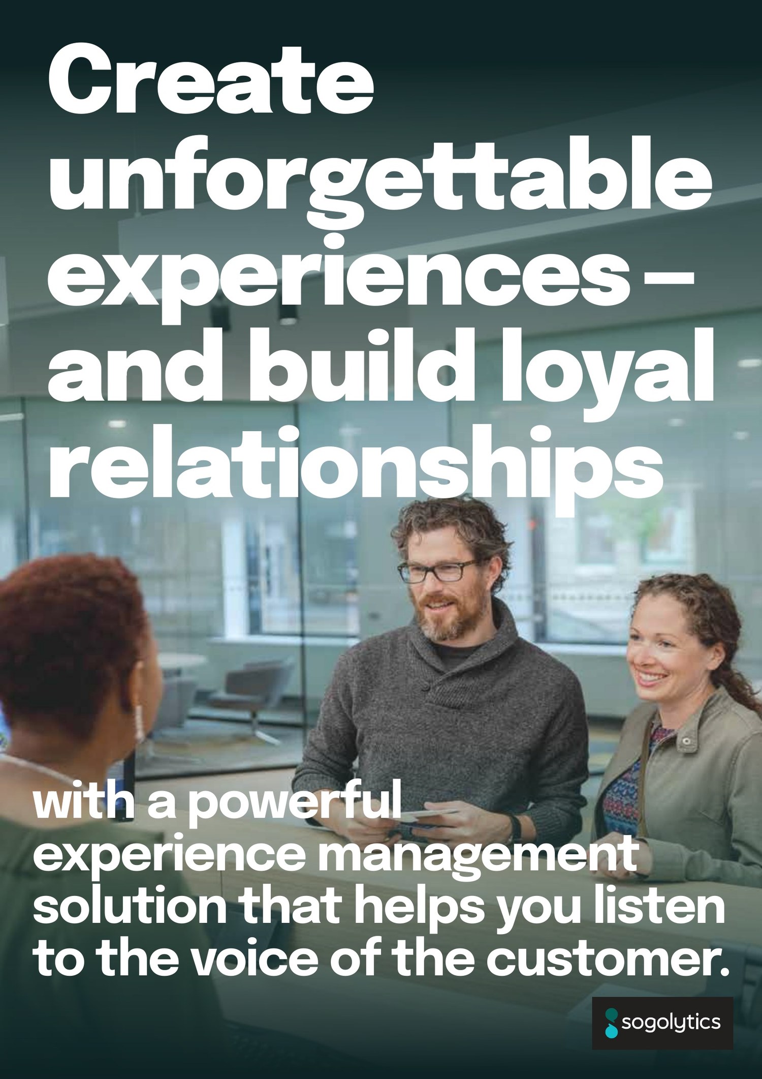
Native unit · webinarThe part of a rebrand nobody photographs and every sales team actually uses. White papers and handouts cut by vertical, finance, fitness, HR, hospitality, so a rep walks into a credit union conference holding something written for credit unions.
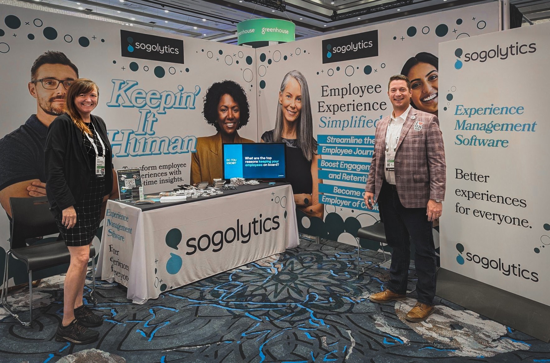
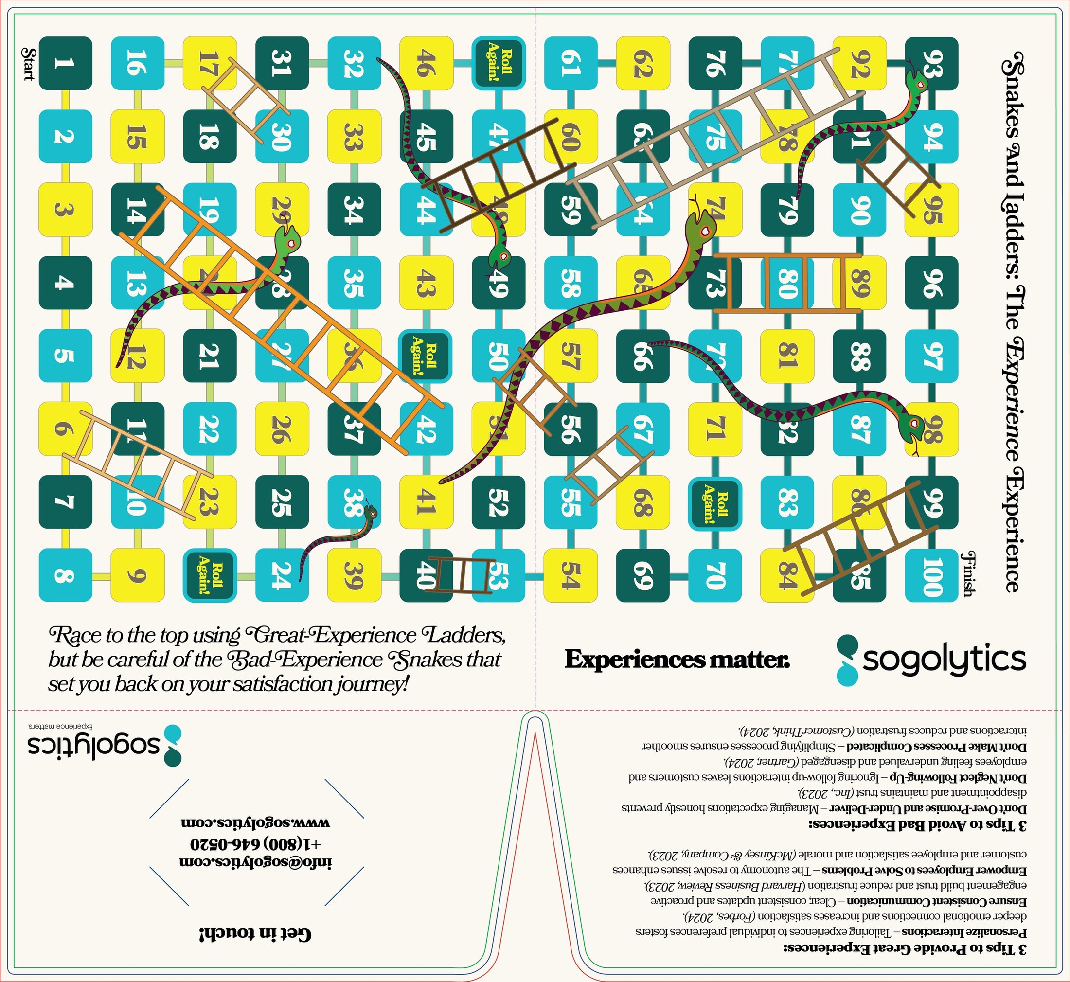
Plus the physical layer: a die-cut presentation folder, event handouts, take-away cards, and a trade show backdrop that had to work as a photograph long before it worked as a wall.
Preview 3 pages
Preview 3 pages
Preview 3 pages
Preview 3 pages
Preview 3 pages
Preview 3 pages
Preview 3 pages
Preview 3 pages
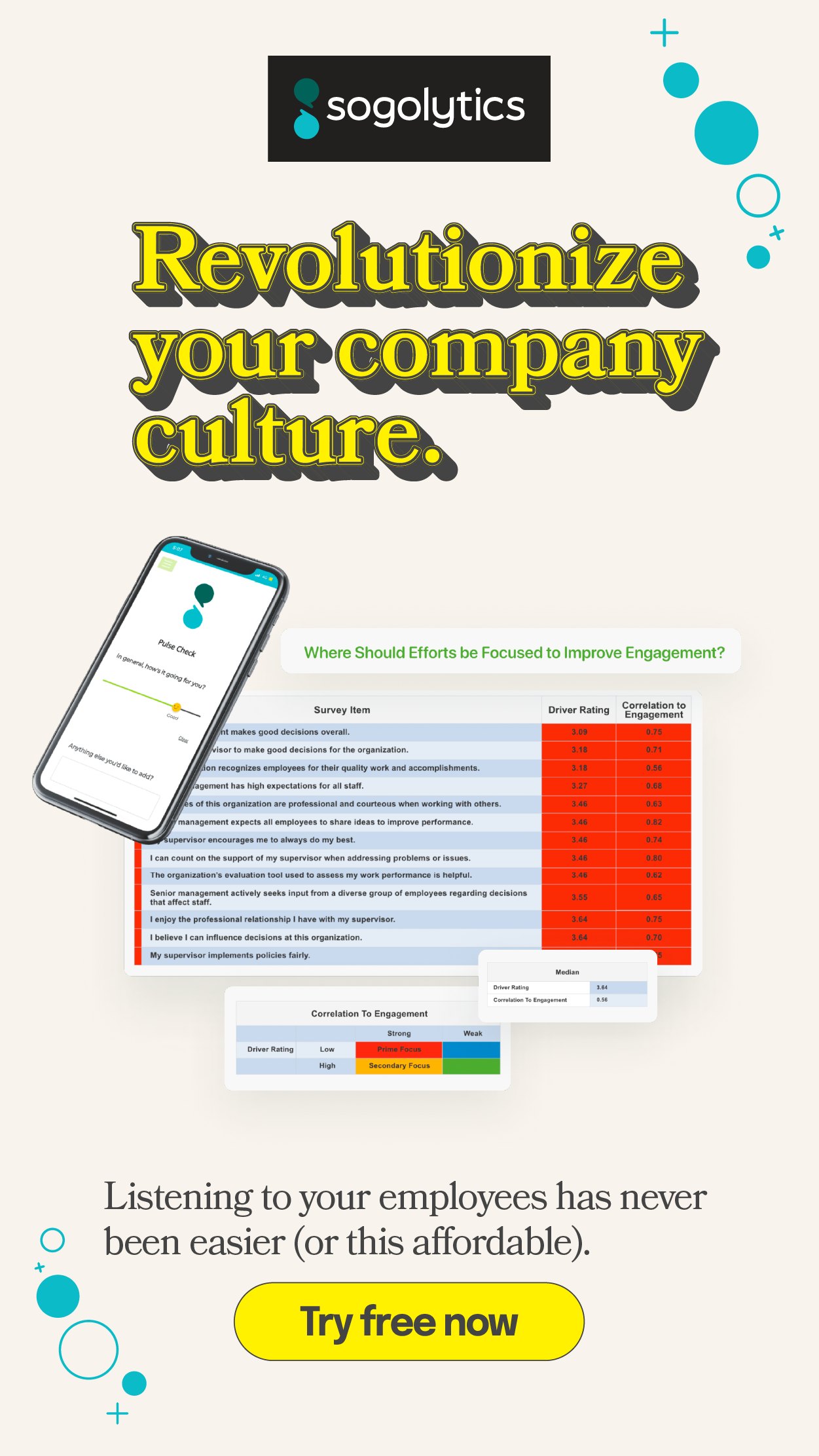
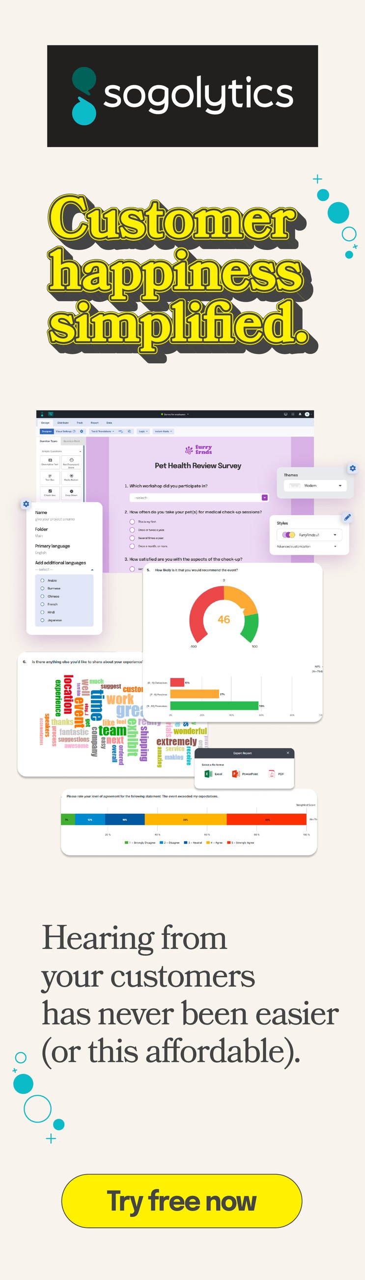
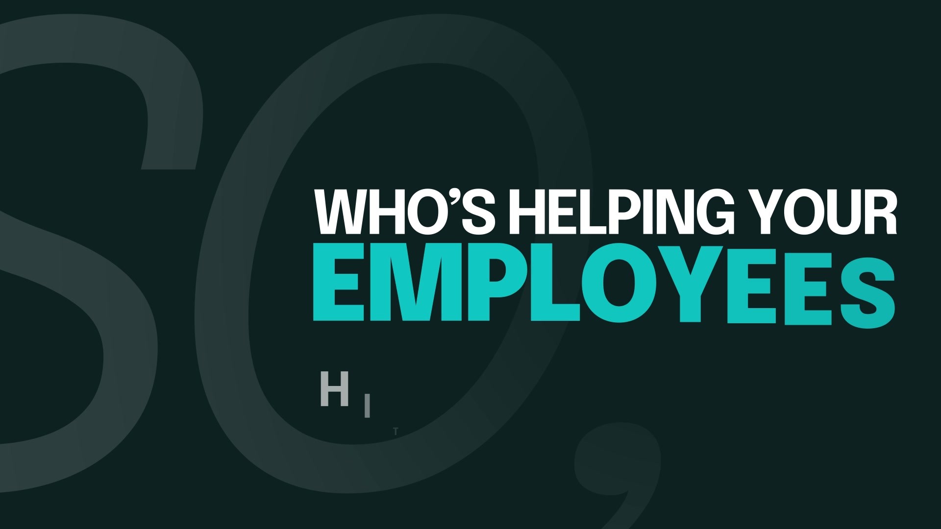
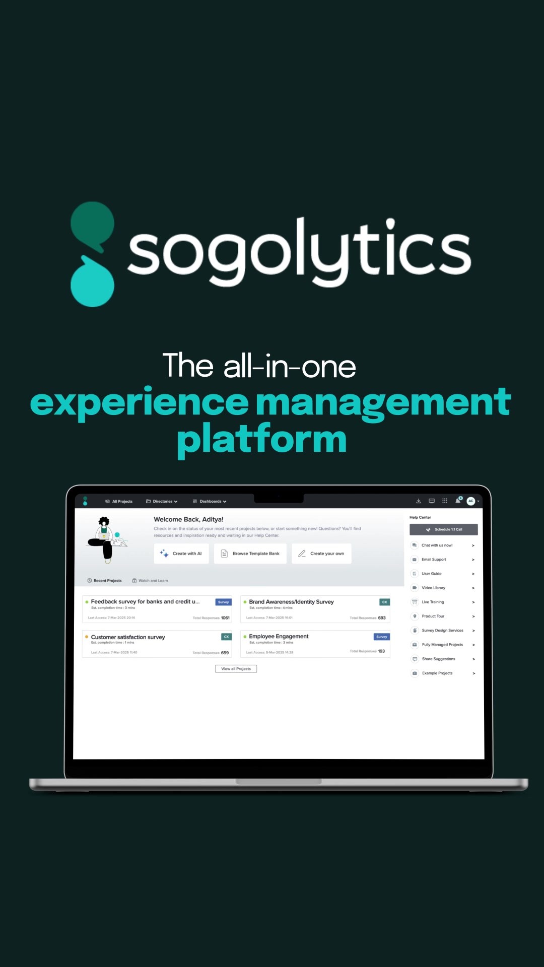
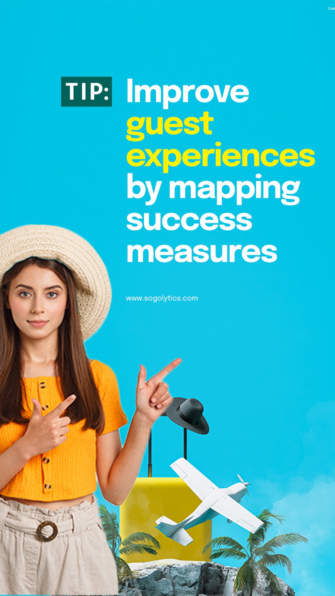
Preview 3 pagesShort-form paid social cut for square, vertical, and 16:9 from the same edit, in the same typographic system as everything else, so a scroll past a Sogolytics ad feels like the same company whether it moves or not.
Cut by vertical again, finance, fitness, employee experience, plus a run built around a single named account.
Named account · who is helping your employees, 16:9
Fitness · everything, square
Finance · but, square
Performance, retention, morale · square
All-in-one platform · square
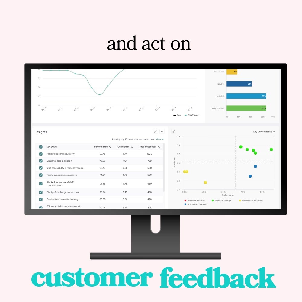
Act on customer feedback · square
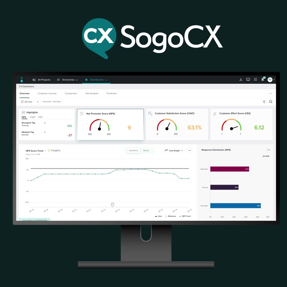
SogoCX product cut · square
Performance, retention, morale · vertical
All-in-one platform · vertical
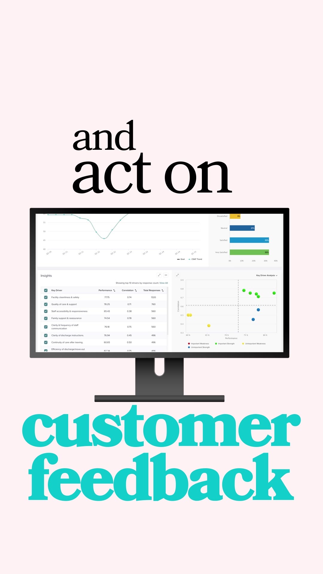
Act on customer feedback · vertical
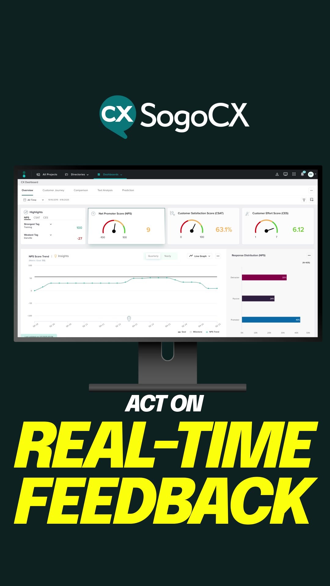
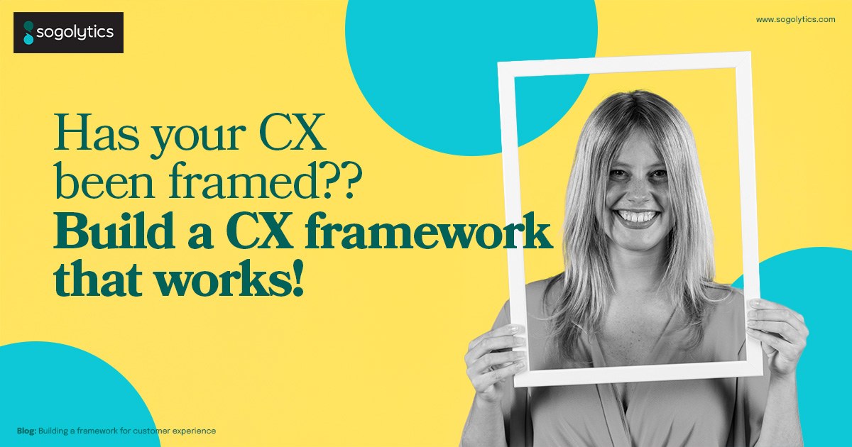
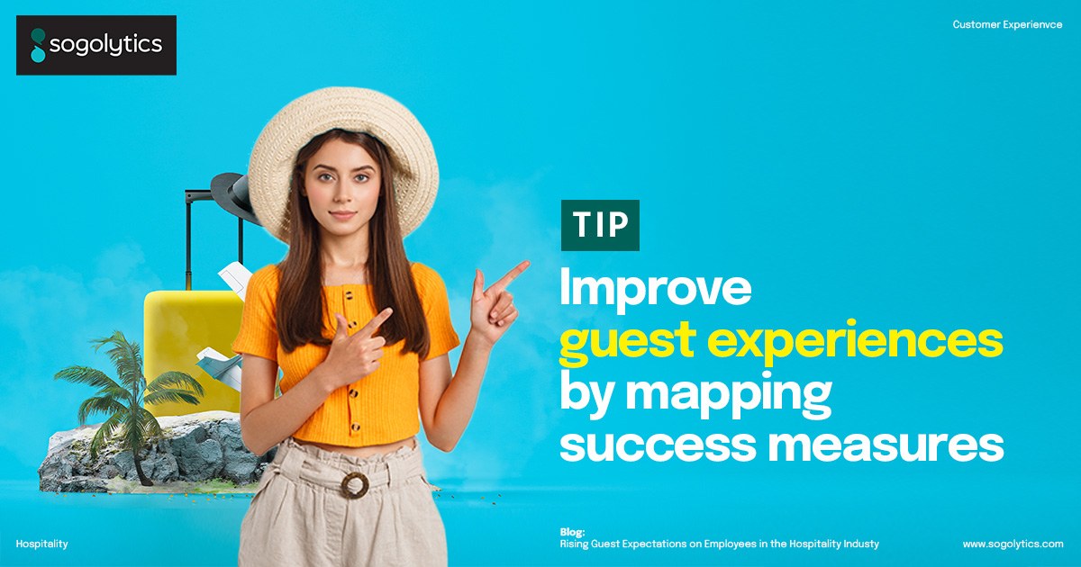
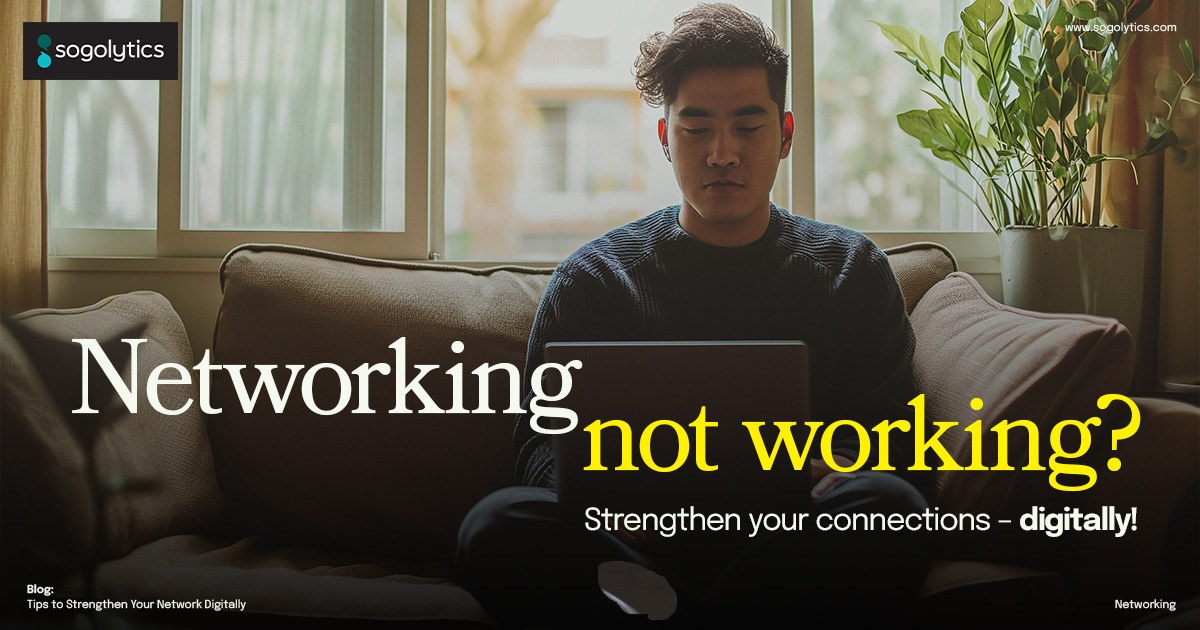
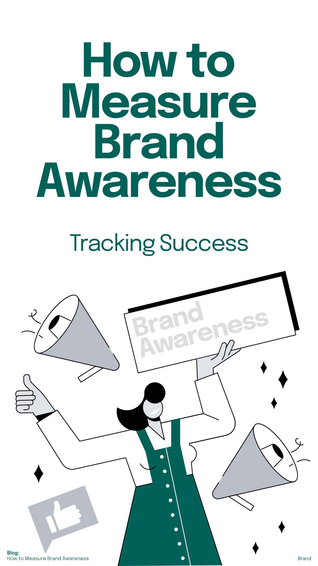
Act on real-time feedback · verticalAn organic program running three crops off one layout, feed post, story, and in-feed square, so a blog going live turns into a week of social without a designer opening a file.
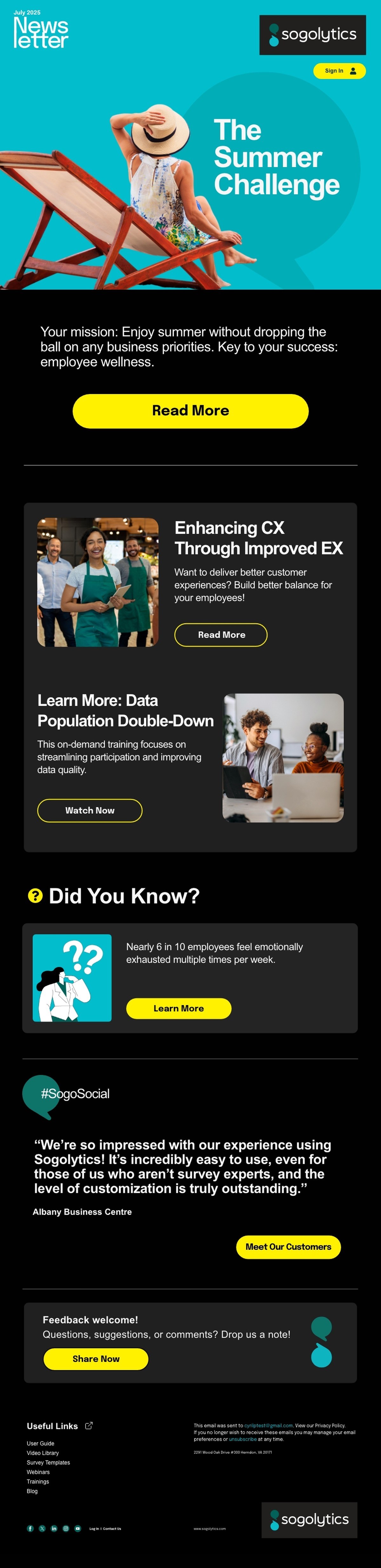
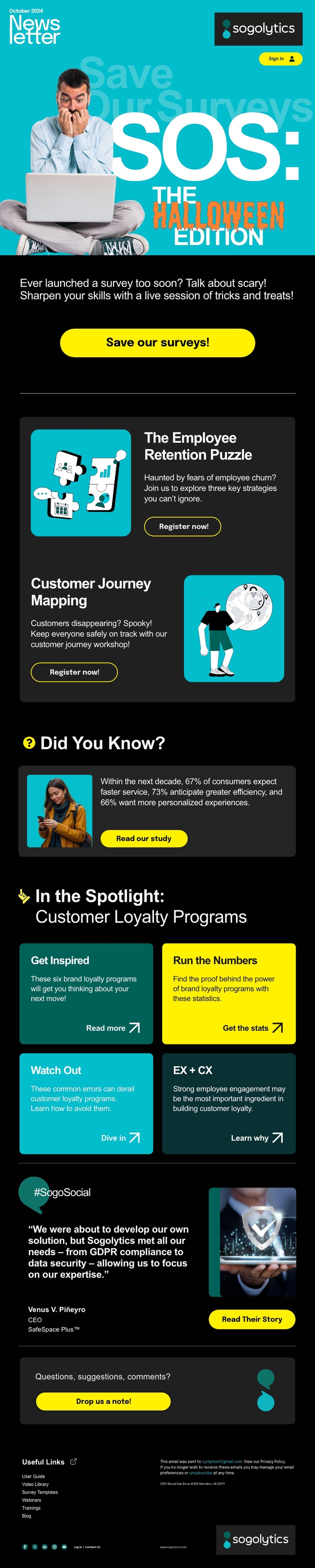
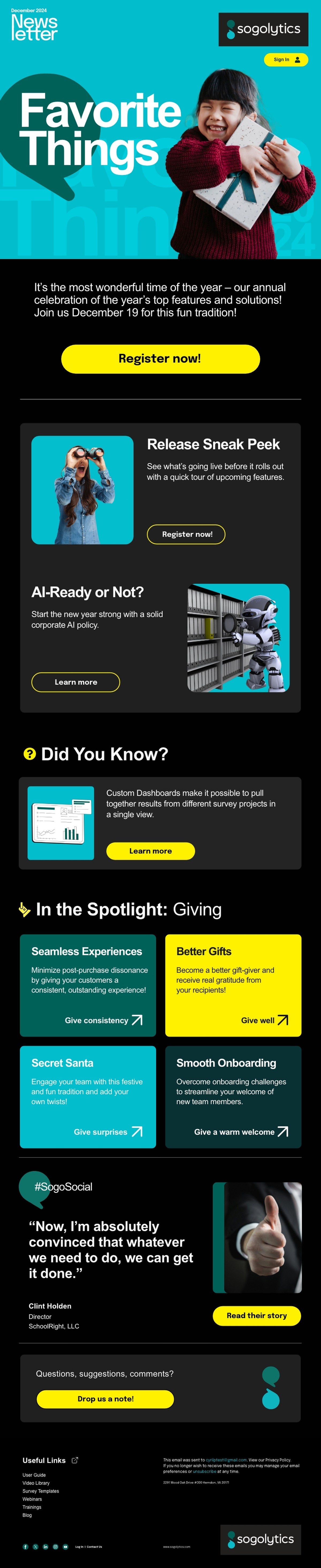
Underneath it, two years of a monthly newsletter in paid and unpaid versions off a single template, segmented by vertical and by lifecycle stage. Both are built as modular blocks on purpose. A program that needs a designer for every send is a program that quietly stops going out.
Plenty of studios can show you a nicer logo. Very few can point at a creative decision and trace a line from it to a tenfold change in revenue, because most never stay long enough to find out whether the work did anything.
This one ran from the name through the guidelines, the site, the ads, the sales floor, the trade show wall, and two years of monthly email, with one team holding the whole thing and training the rest of the company to keep it. That continuity is why it worked, and it is the argument for hiring one studio instead of three.