Young Bosnia

One artist,
four faces.

An independent music project with no single look, on purpose. A synthwave logotype for the releases, a graffiti hand for the mixtapes, a bear, a skull, and a VCR treatment for the video. The job was not to pick one and enforce it. It was to make four different registers all read as the same artist.

RoleCreative direction
SectorMusic, independent artist
ScopeIdentity, cover art, video
OutputLogo system, four covers, two videos

A band is not
a company

Most identity work is built to stop things from drifting. One mark, one palette, one voice, applied the same way every time, because a company that looks like four companies loses the argument before it opens its mouth.

A music project is the opposite problem. Consistency reads as a marketing department. An artist who ships the same cover treatment four times running looks like they stopped taking risks, and the audience is there partly to watch the risks. But an artist with no through-line is not an artist yet, they are a folder.

So the system here holds two things and lets everything else move: the name always set by hand, never typed, and a palette that stays in the same corner of the spectrum whatever else changes. Four covers that share nothing else still sit together.

01

The mark,
and the monogram

LogotypeMonogramSocial

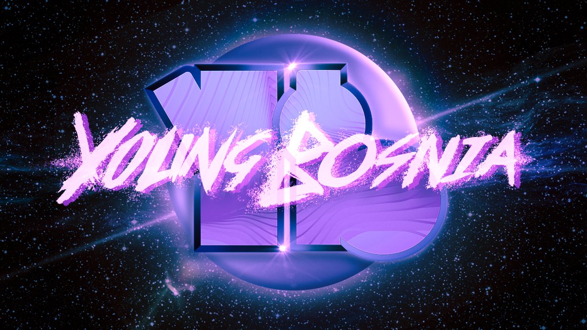
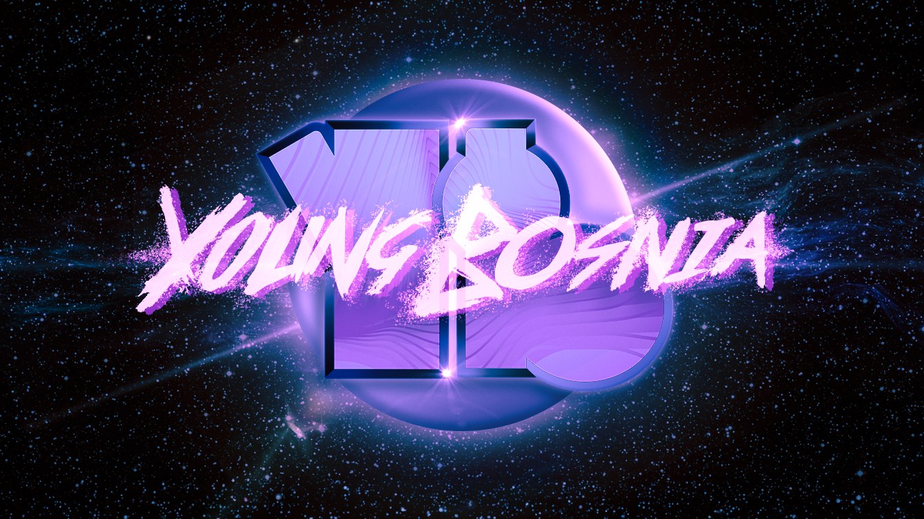
The logotype is drawn, not set. The letterforms lean, the strokes break, and the terminals fray, which is what keeps it from reading as a typeface someone licensed. It sits over a synthwave field that gives the releases a period the music was already arguing with.

Underneath it is a monogram that carries the same shape with none of the noise. The Y and the B share a stem and lock into a single form, which is what makes it survive at the size of a profile picture, a stamp, or a sticker. The full lockup is for covers. The monogram is for everywhere the lockup would turn to mush.

02

Four covers,
one hand

Cover artIllustrationCollageType

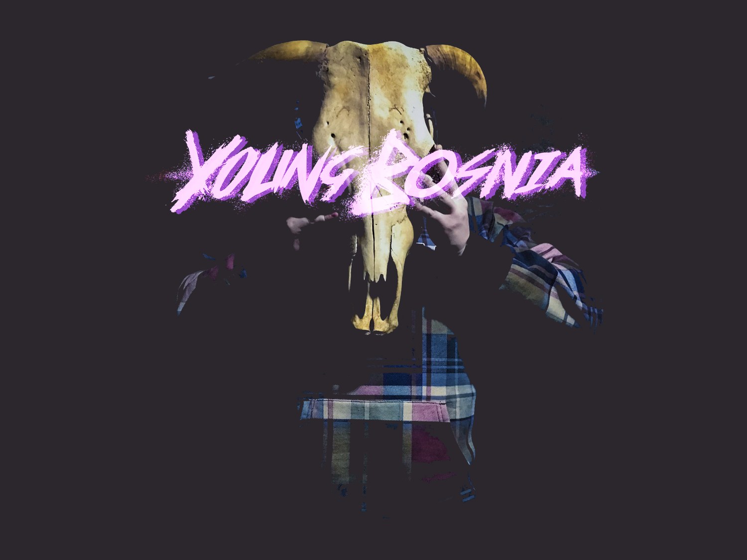
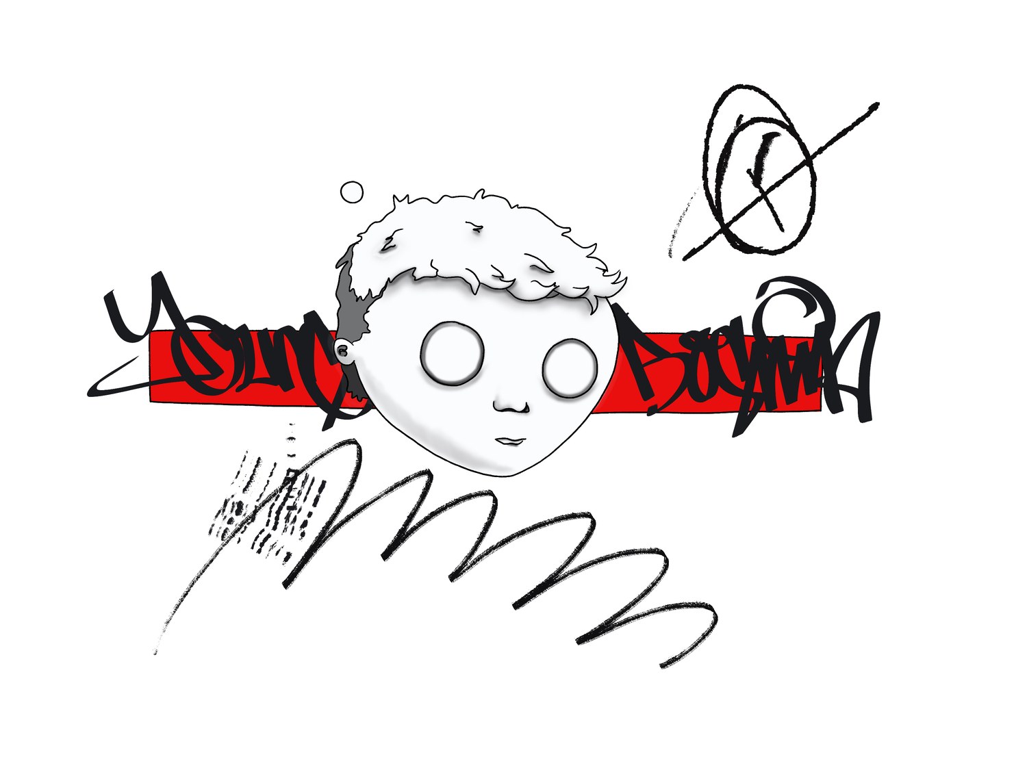
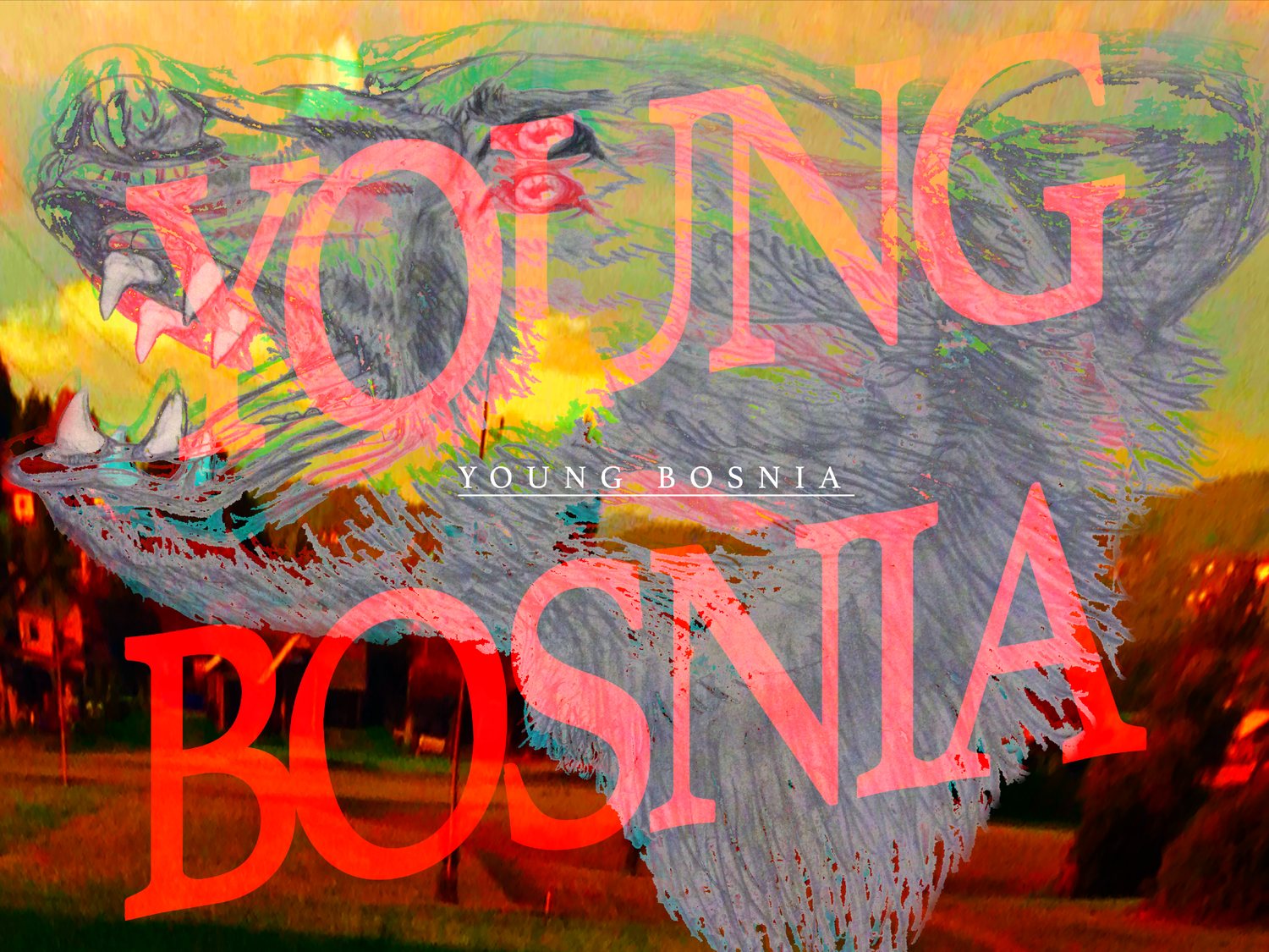
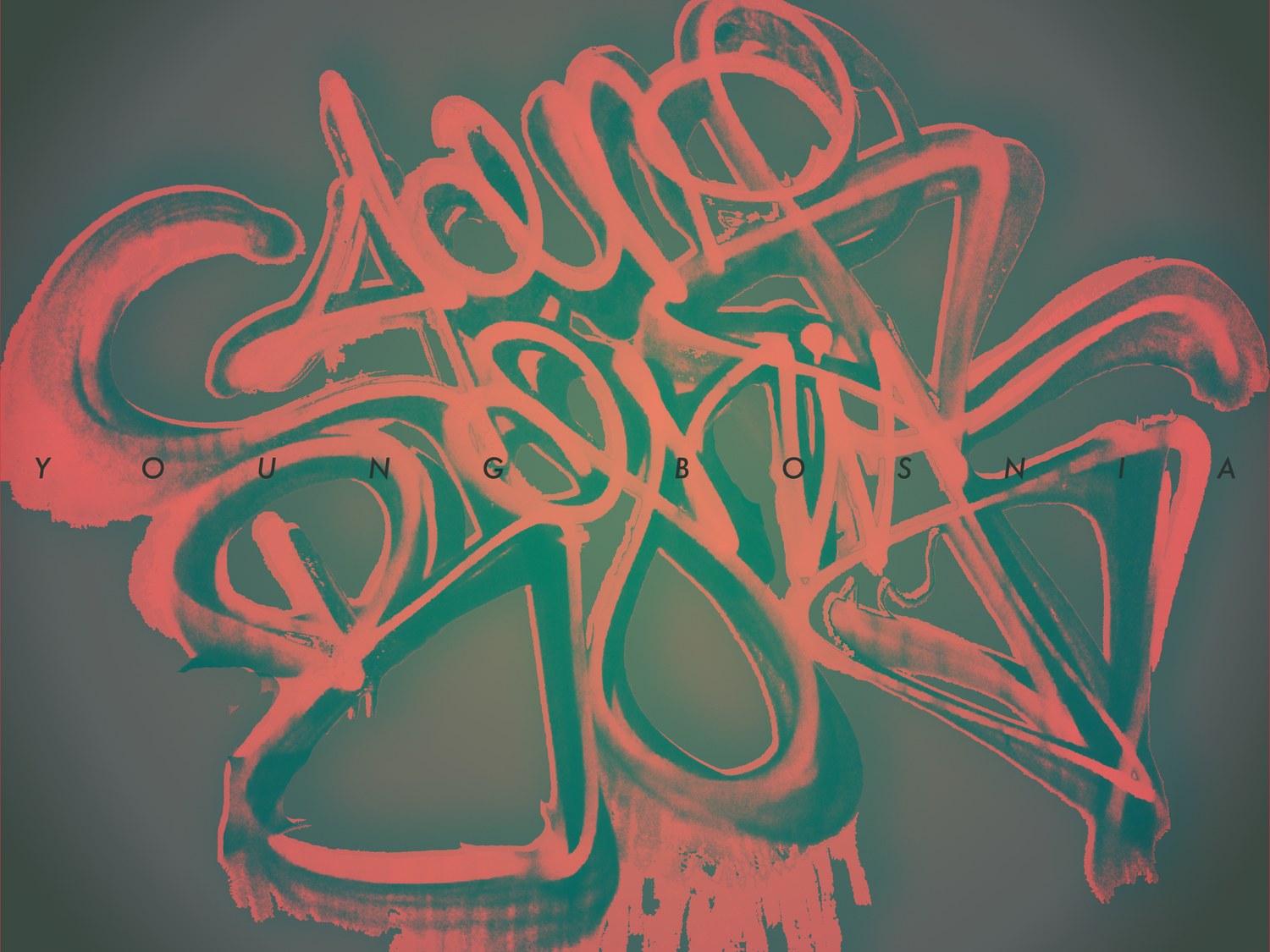
Four releases, four completely different treatments, and the only fixed rule is that the name is always drawn by hand. A skull held up as a mask. A bear over a burnt landscape with the title set enormous and half transparent. A graffiti throw-up shot and duotoned. A line drawing with a red bar through it.

Nothing in that list is a house style, and that is the point. What holds them together is the hand, the coral and violet the palette keeps returning to, and a willingness to let the type get in the way of the image rather than sit politely beside it.

03

Two videos,
one texture

VideoTreatmentGrade

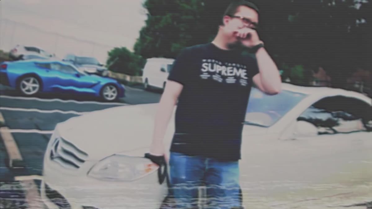
Both pieces are built on degradation. Tape dropout, chroma bleed, tracking error, a grade pulled most of the way to grey and then pushed back through the wrong channel. It is a cheap effect used badly almost everywhere, and it works here because the project is already about a specific decade it never lived through.

The remix video is the one that travelled. The Fire cut is the same treatment applied to original footage, and it is the better demonstration of the grade because there is nothing else in the frame carrying it.

Halsey, Control Young Bosnia trap remix
Halsey, Control, Young Bosnia trap remix
Fire VCR treatment, original footage
Fire, VCR treatment

Why this one
is here

This is the oldest work on the site and the least corporate, and it stays because it is the clearest evidence of something the other cases only assert: that the studio can build a system loose enough to keep moving and still hold.

A brand system is usually judged on how well it prevents variation. This one was judged on how much variation it could survive. Both are the same skill pointed in opposite directions, and a company that only ever sees the first version has no way to know whether we can do the second.

Next

SentiLink

Two complete directions, built side by side →

Let's strike
while the iron
is hot.

Companies leave here looking like one company again. The same voice on the site, the deck, the ad, and the booth. Every quarter you wait is another quarter of good work going out under a brand that undersells it.

Prefer email? hello@ambolt.co
First three pages shown. Scroll sideways to move through them.